
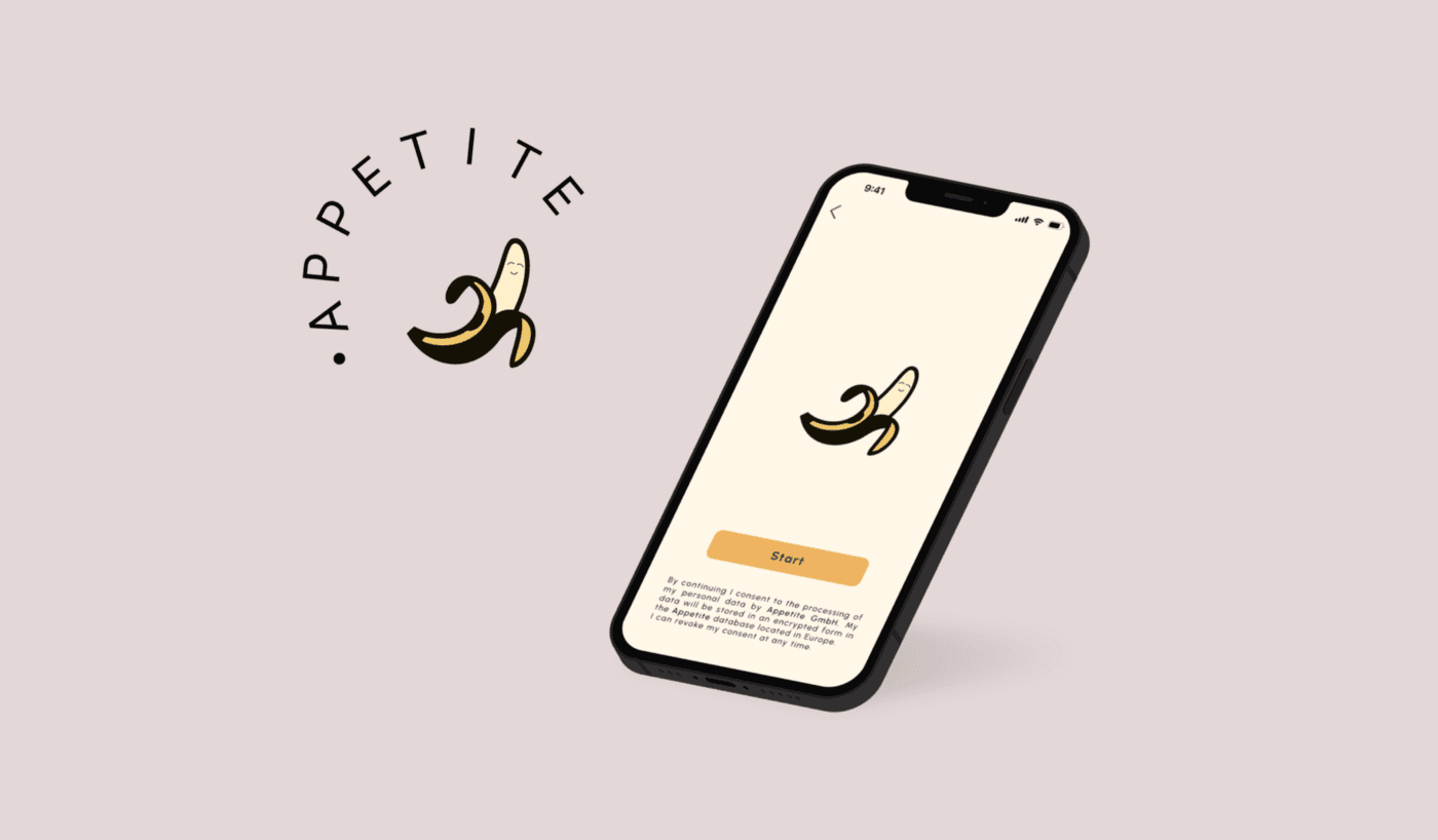
Enough toxic positivity, APPETITE is here
| Services | Platform | Client | Industry | Date |
|---|---|---|---|---|
| UX/UI Design - UX Writing | Mobile (iOS & Android) | Daily Health Conference | Food & Health | Sep 2022 |
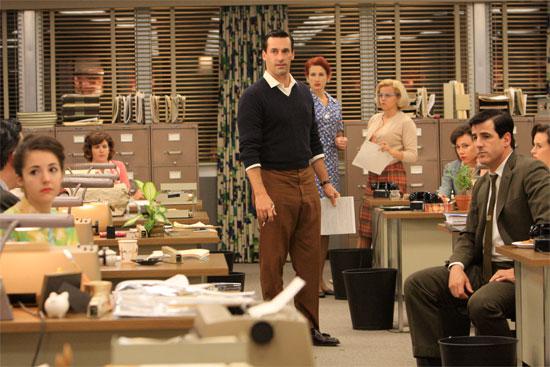
I feel like a copywriter from the 50s in Mad Men when they used to write those catchphrases and Don Draper would come and yell at you like there was no tomorrow. Welcome to this new case study.
Brief
Two weeks to finish. A team of two and a single objective: Build a wellness app.
The app should focus on one important aspect of wellness (backed up by user research). One of the main goals of this project is to design the UI and validate the UX. Also, it should monitor the users’ progress and encourage them to adopt a healthier lifestyle and, users must retain control over their personal data (GDPR Compliance).
The Client
Our client is the Daily Health Conference. A non-profit organization dedicated to promoting health and wellness through impactful public talks, participatory workshops, and professional training around the world, but its program has been slow to catch up with technology. As a result, they have organized a competition for the upcoming conference: designers will present their wellness app ideas to a jury of wellness professionals, designers and investors. The winning concepts will be presented at the conference and will become the Daily Health Conference’s first set of digital apps.
Must-Haves
- Users need to be able to set up their profile to include important information relevant to their goals
- Users need to be able to set goals and track their progress
- Users need to be able to edit, share or delete their personal data
- Users need to be informed about the usage of their personal data (This is an opportunity to practice UX writing)
- Users need to receive feedback from the system (empty states, errors…)
Empathize
Diet & Nutrition Apps: Secondary Research
According to Data Bridge Market Research, U.S. Diet and Nutrition Apps Market is expected to grow with a CAGR of 20.9% in the Forecast Period of 2020 to 2027. The main elements driving the market growth are the increasing number of people doing online fitness training and the increasing use of internet and smartphones. Moreover, increasing awareness about its various benefits, such as its use to make healthy lifestyle changes, allowing them to set fitness goals, track calories consumed, get workout ideas and share their progress on social media, helps users to be more motivated, which also acts as a driver for the market. This is enough validation to look for opportunities in this sector.
Quantitative research
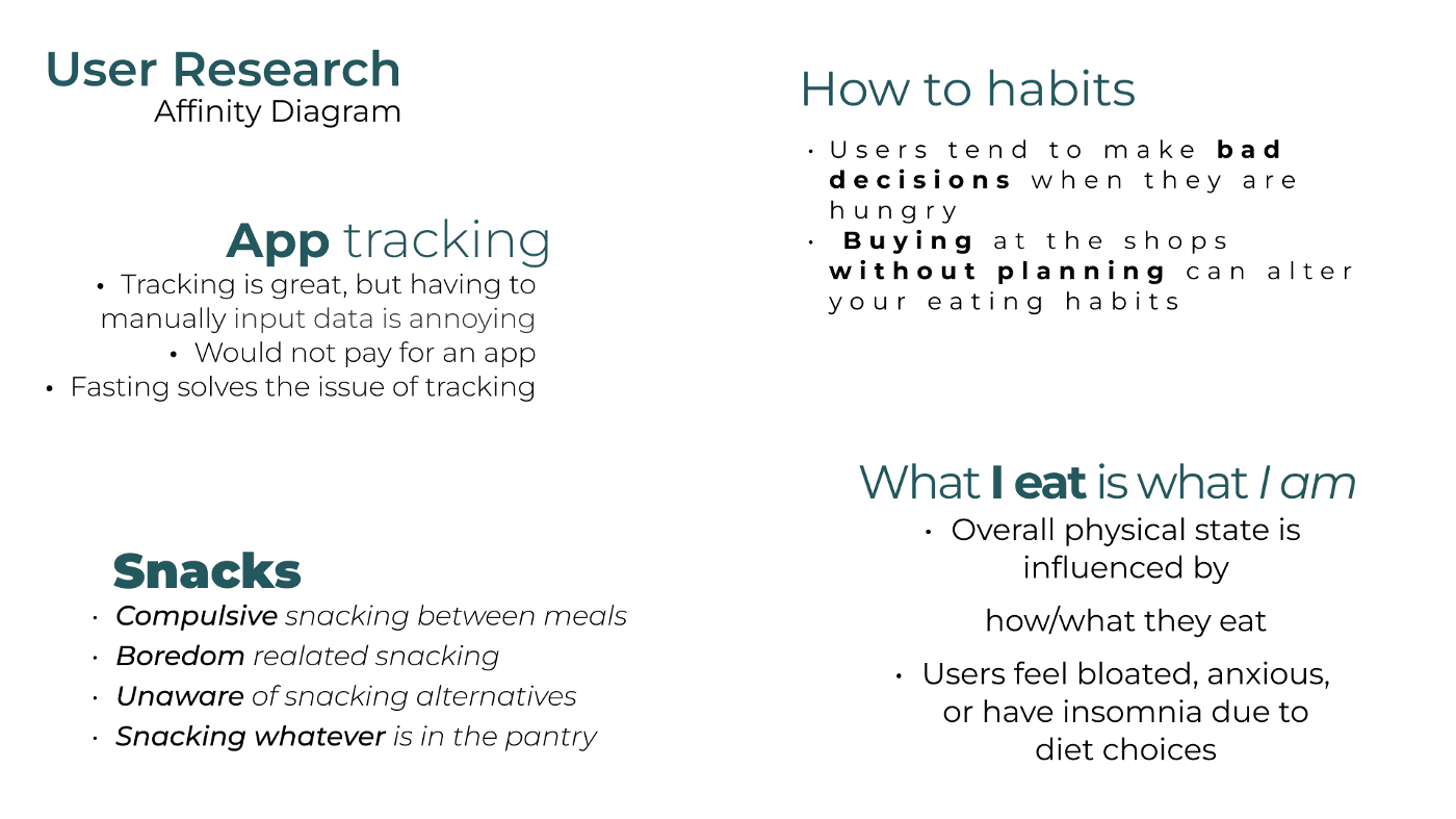
When we start, we first think of an application for a niche target group, such as people with diabetes. As far as we know, there is a very close relationship between diabetes and food. Therefore, we decided to conduct a survey to better understand potential users’ opinions about the food sector and their knowledge about food in general. This way we would know what users think and feel about the space in which our product would fit. But the surprise came as soon as we received the first results documented: we didn’t meet the target of users with diabetes through the survey call, but we still asked people how much they knew about eating habits, dietary deficiencies, and healthy routines without that horrible, despicable toxic positivity that characterizes food apps and food tracking apps.
While conducting the survey, we decided to do some market research on healthy style apps on the market, food trackers, etc. We noticed that the market was full of diet and nutrition apps. And that’s when we realized, we wanted to develop an app that focuses on positive changes to prevent health problems but discards the toxic positivity aspect, which is a recurring feature in the health industry.
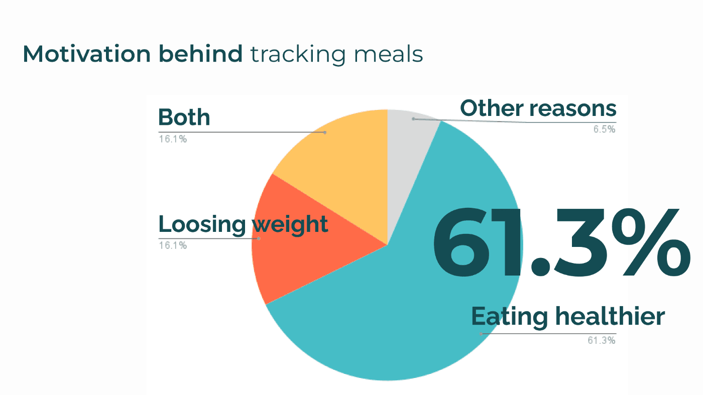
We surveyed 40 people, and the results spoke for themselves:
- 61% said that their motivation for tracking their consumption was to “eat healthier”, as opposed to 16% who said their motivation was exclusively to lose weight.
- 44% would like to be more orderly when going to the supermarket, i.e. to keep a list. But they simply forget.
- Almost 70% plan their meals
- 83% want more quick recipes
- 77% want notifications about nutrient deficiency while tracking meals
Qualitative Research
We jumped straight to user interviews where we dug deeper into how the user behaves regarding eating habits and tracking apps. Among our findings, we learned that keeping track of eating is very hard to maintain through time and be consistent. Many people were using chats to themselves to make shopping lists, and the concept of dieting=losing weight is old-fashioned and toxic.
Now what? With all the information we had gathered we made an Affinity Diagram and organized all the information.
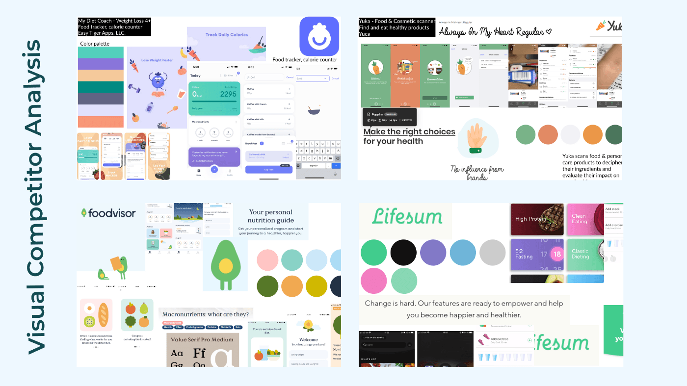
Business and competitive Research and insights
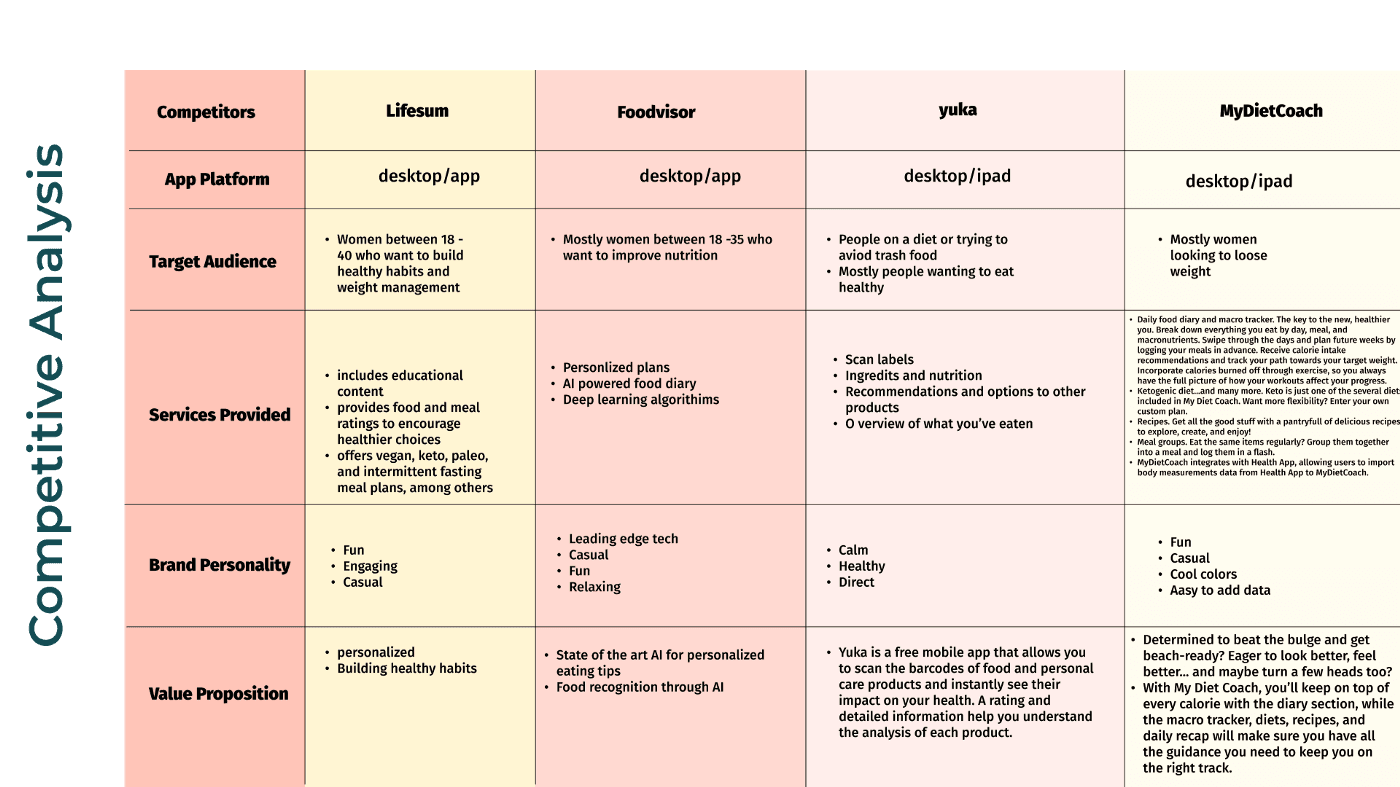
To name a few competitors, we found Yuka, the food coach, the foodvisor, lifesum…all with a lot of point in common.
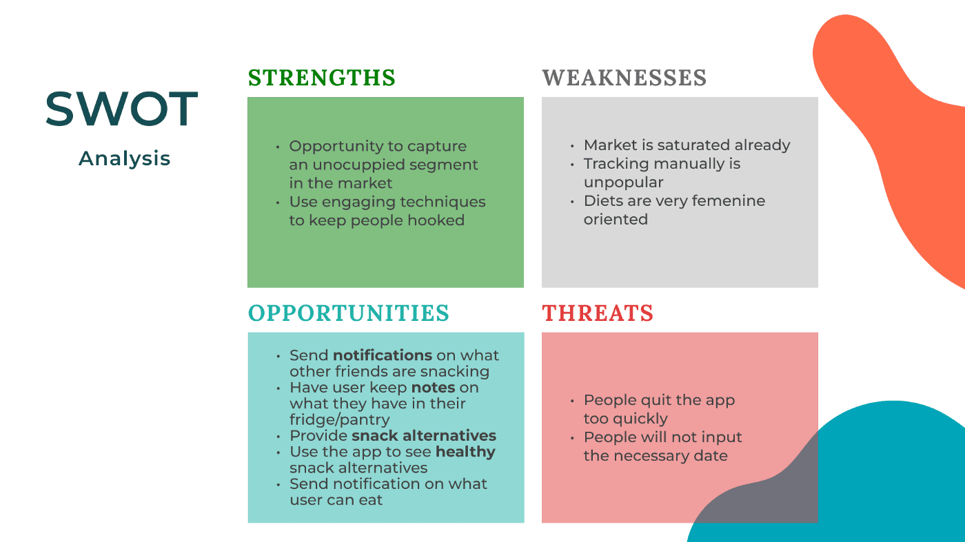
With our data, interviews, and research, we were able to make a swot analysis before any action regarding ideation. At this point, it is very important to start categorizing and discarding any function that we don’t need. We knew some of the treats like “ people don’t like to track” but we also knew info like people likes to be engaged with the apps, a kind of gamification of the goals.
Define
Once we could see all the information we dropped all the insights on an affinity map and started creating our user persona and User journey.
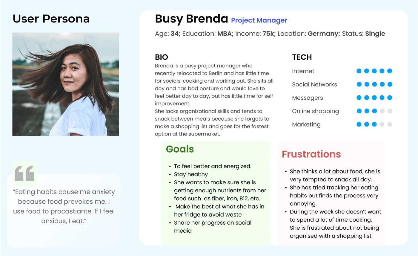
Our user persona is a woman in her 30s, professional and busy who cares about her eating habits but feels ike there is no time to inform herself a little more. She also is always on the edge of snacking the worst option in her house and consequently feels very bad. ring a bell? Yes, to me too.
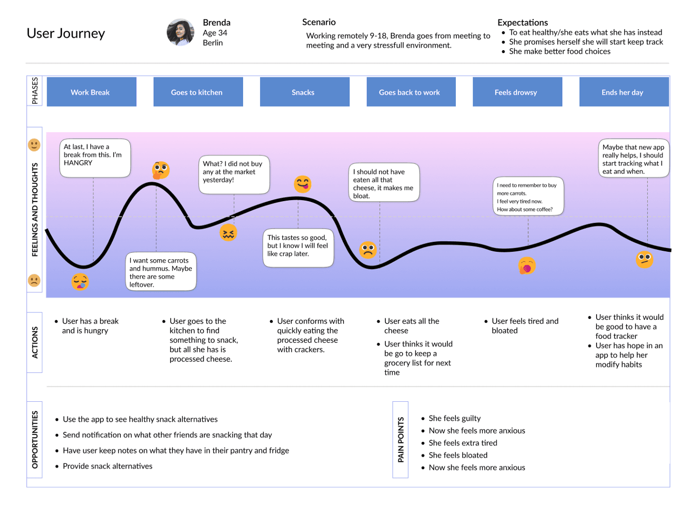
You submitted that crazy copy your boss asked for, and you are ready to chill with some tea and carrots in front of your tv, but you see those chips in the pantry and that beer on the fridge and after a blink of an eye, you finished all, never started that show you wanted to watch and feel like crap after eating the whole bag.
With all this information we were ready to create a Problem Statement.
Users need to find a way to eat healthily, keep track of their pantry and choose from a variety of recipes and quickly input their data because most food tracking apps require a lot of time.
Therefore our MVP is to create an app that helps users modify habits by keeping track of what they eat, providing creative recipes with what they already have, and sharing shopping lists executed in a fun, chill way.
IDEATE YEAH!
Our ideation began with brainstorming the ideas and a crazy 8, where we captured our own point of view of what our app was going to look like and have.
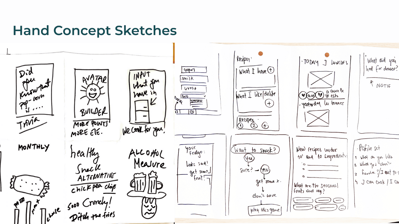
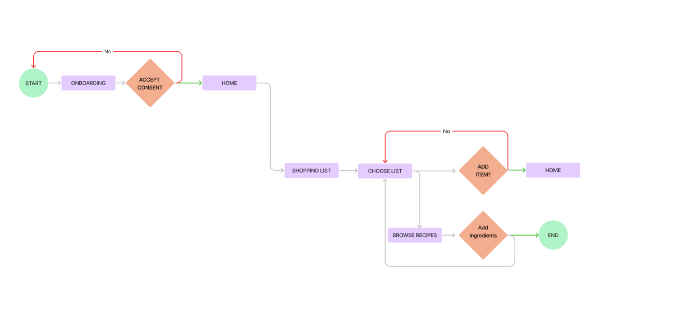
We made some concept testing interviews with the low-fidelity sketches and validated some of the features we were thinking like the grocery shopping list, and the “fridge” function, and right after that we ideated some user flows before starting to do a wireframe for the next stage.
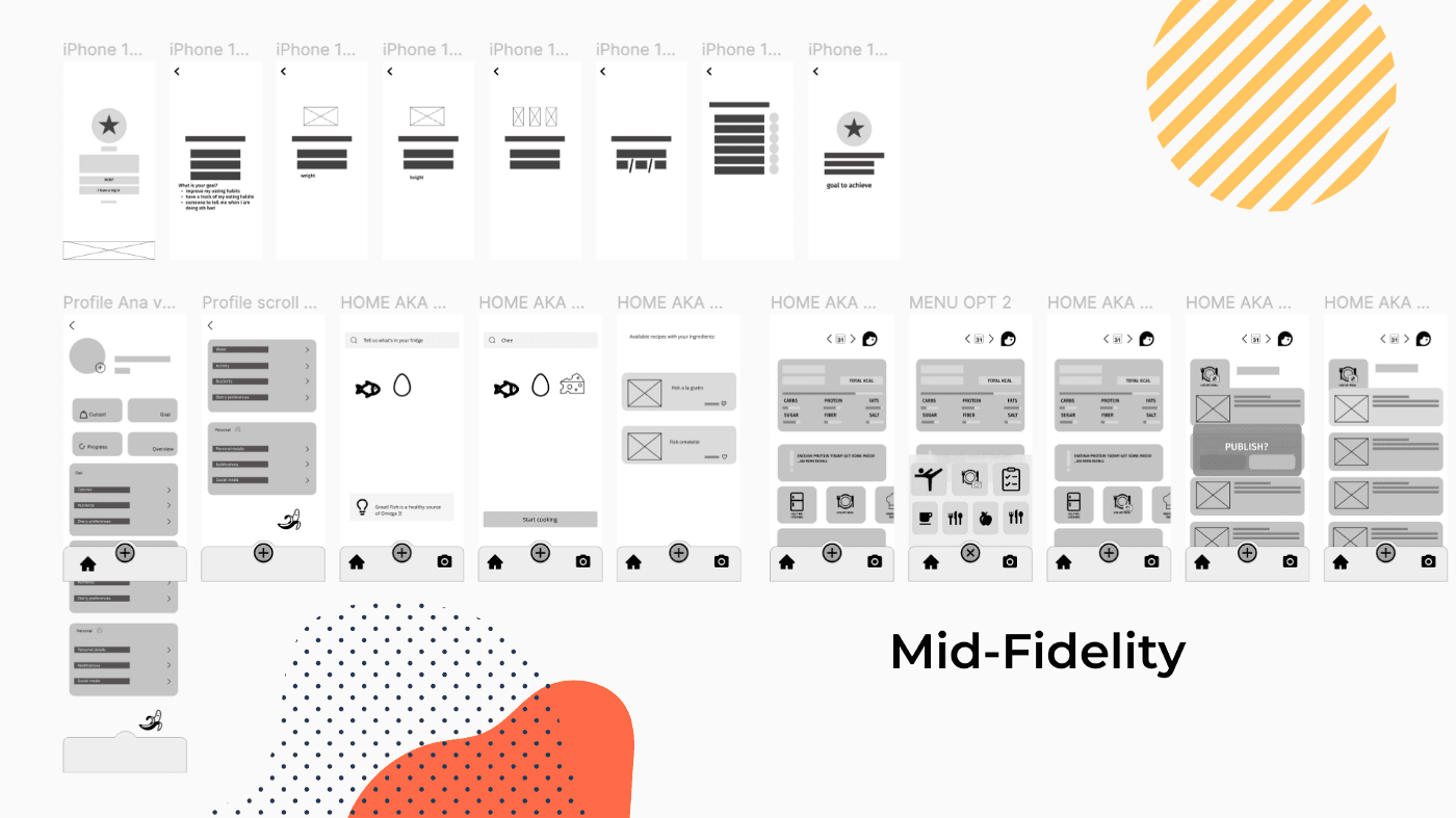
Mid Fidelity
Conducting testing for this part was fun since many of the features are “new” and our user subjects were unfamiliar with the use of friendly tracking apps. Every testing session was a different reaction to the friendly app to learn more about food. We conducted 7 sessions where we grabbed a lot of information and insights that were very important at the moment of creating our final prototype.
ART ART ART
While conducting user testing, we started to create a mood board for our app to validate the brand values of our product.
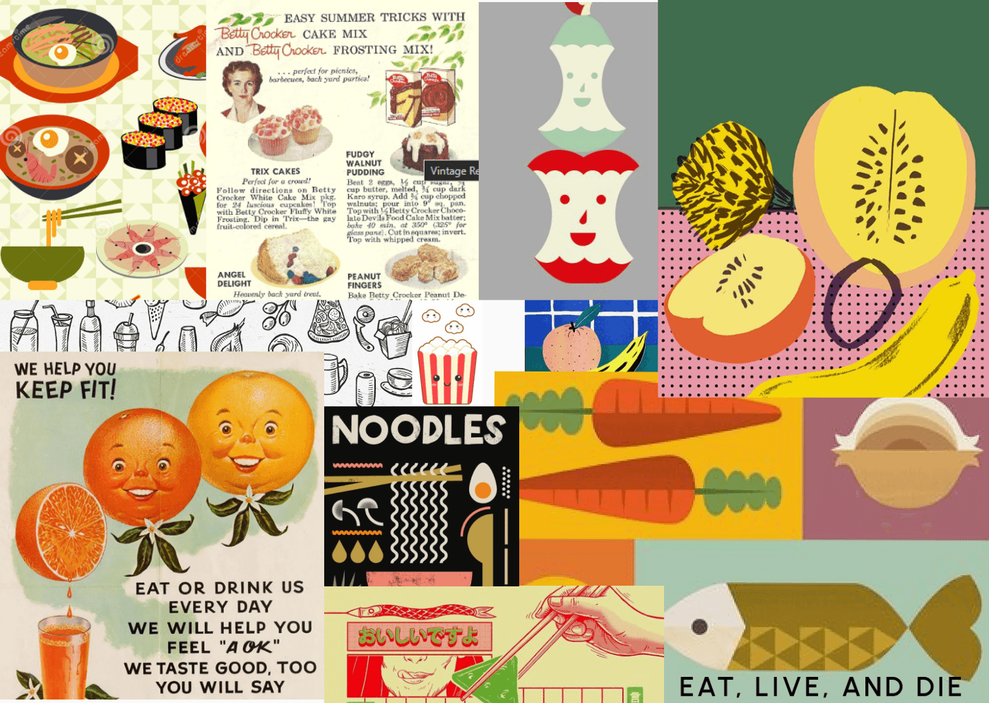
In this case, it was very successful, users told us that the board look guilt-free, humorous and friendly, and approachable.
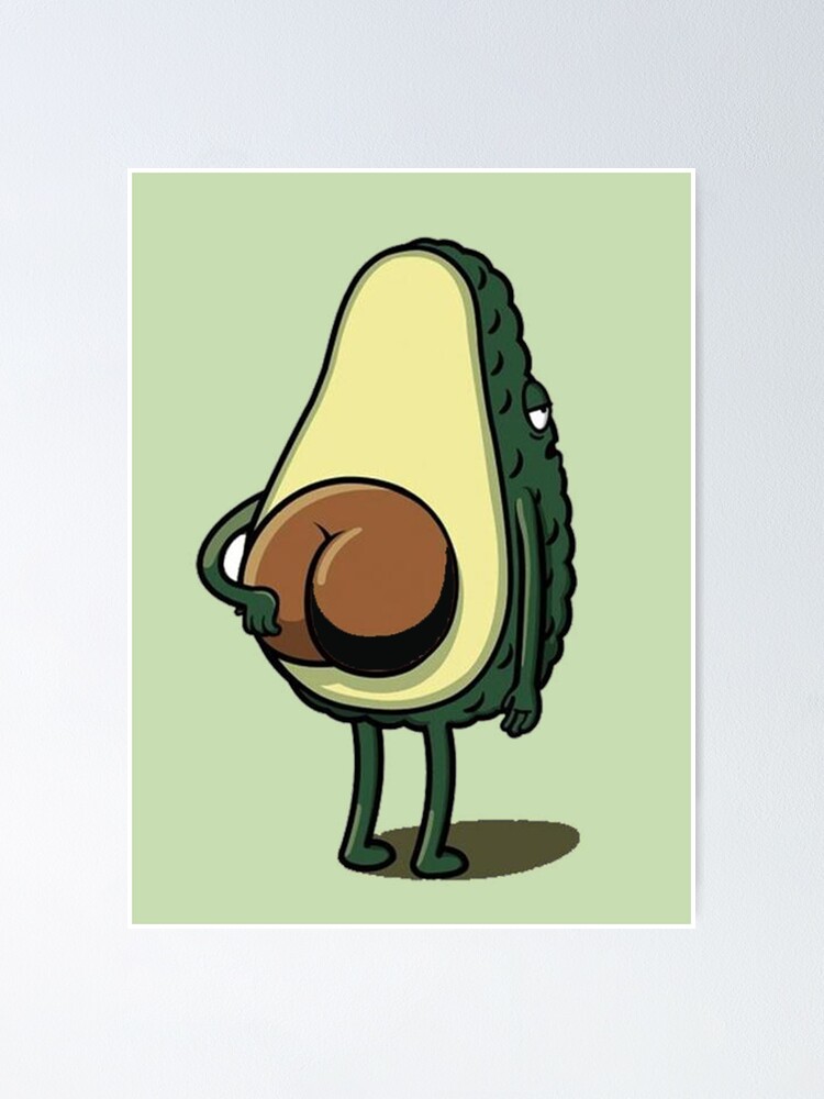
We knew that part of the brand would be tiny rounded vegetables and food products, so that part was embodied in the UI of the app. But for the logo, my colleague Ana created a very happy banana that is the essence of the app and makes a friendly approach to the user without being a boring avocado, like many other diet and nutrition apps. #FreeAvocado
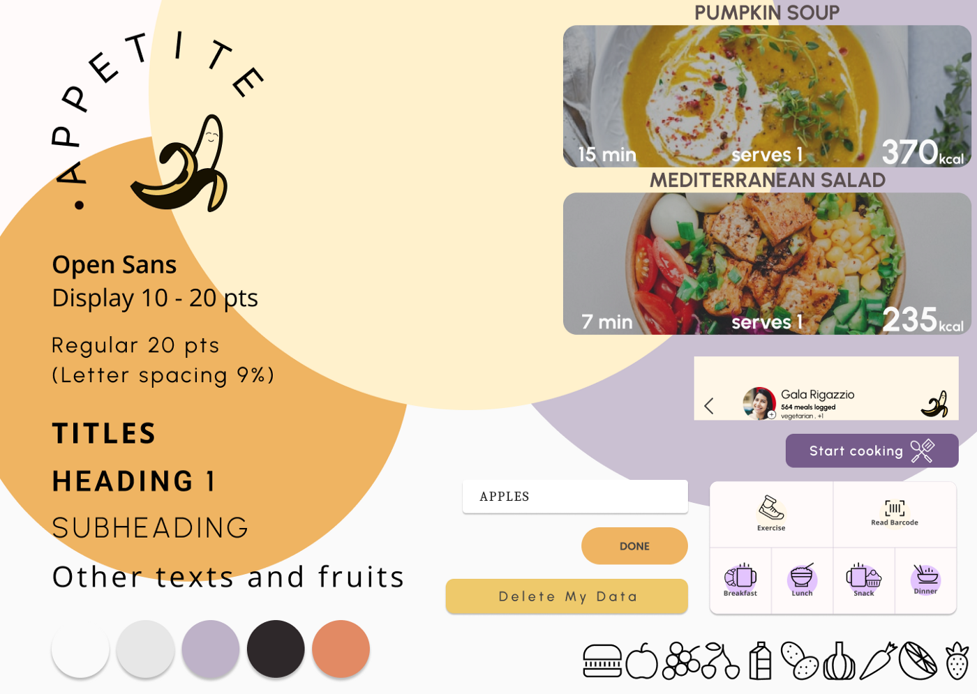
For the style tile, we created a color palette of pastel colors, a primary yellowish, and a more ochre for accents, with some Lila to contrast the banana logo and some similar to white for the background.
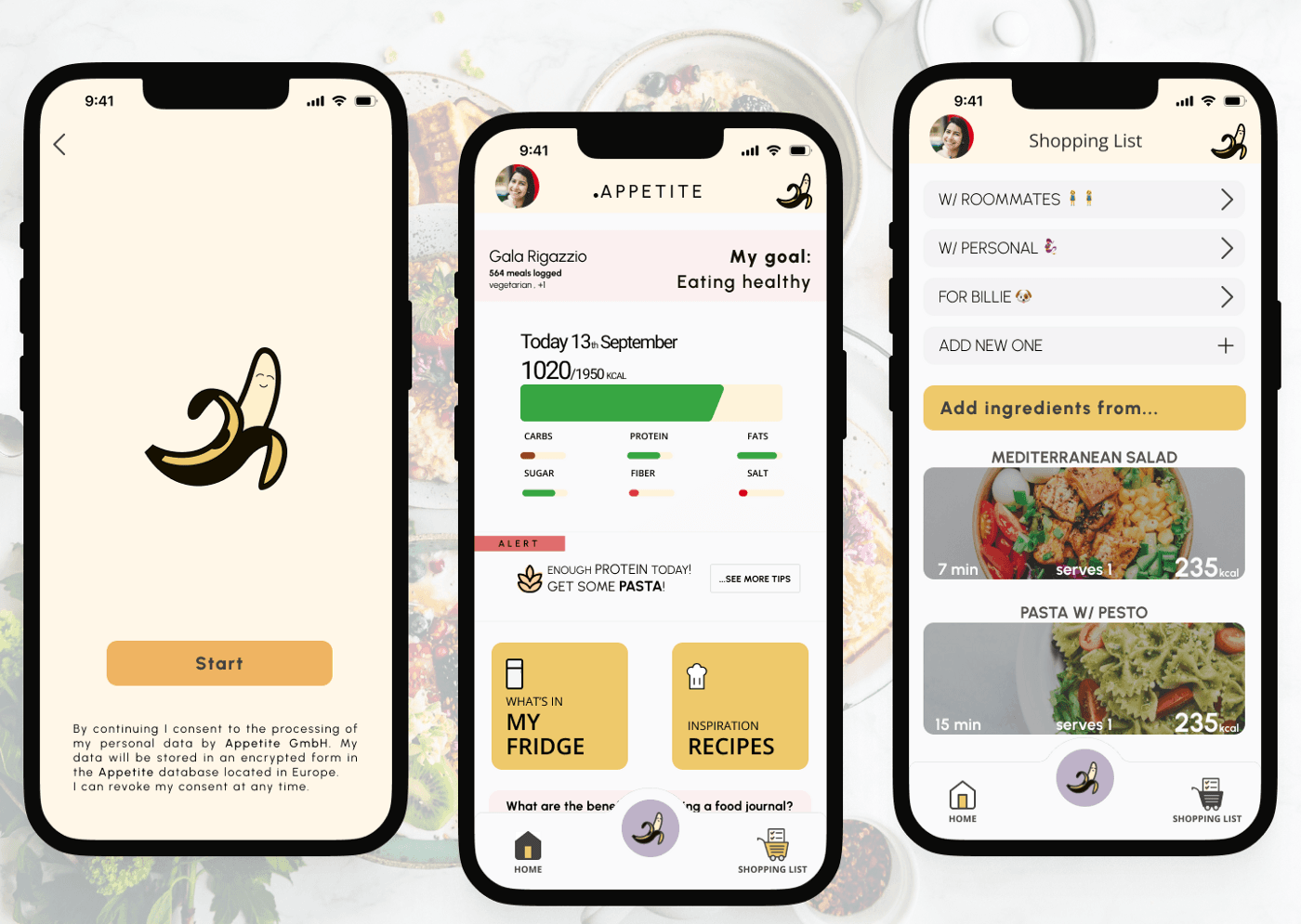
And here is the -almost- final high-fidelity prototype
The Final Prototype
After some changes with insight of the usability testing this is the final prototype.
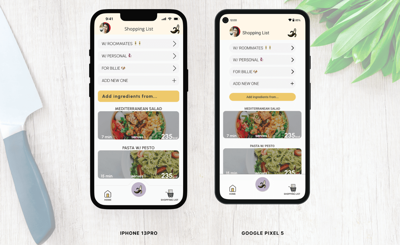
Appetite is a nontoxic app, with a healthy approach. You can’t set losing “weight goals” or search for “low calories” recipes. The goal of the app is to let you track your food, acknowledging if there is a deficiency of nutrients along the way. It also allows you to have a grocery list and also share them among people. And the most amazing feature: My Fridge. This function gives you ideas when you don’t know what to cook. You just let the app know what is in your fridge and pantry and the app will recommend 2 or 3 recipes that are a good fit for your ingredients.
Test
What’s next for Appetite? ITERATE, ITERATE, ITERATE
- Implement the changes after the desirability and usability test (first changes are effective on the Figma link attached to this article)
- Talk to a developer to analyze some features and the implementation of them
- Develop the tracking widget and screen for ios and android
- Improving My Fridge feature to be able to cook with fewer ingredients
- Improve the data displayed on the dashboard
We learn that research is a crucial point of the process. It’s key to even scope the main features or goals we want our app to do. We learned that there are many difficulties along the way: a close deadline, not too many hours of sleep, and a lot of responsibilities with a “client” but our duty needs to be focused on putting the user on the main stage of our project. Product people need to stop falling in love with their ideas and try to make the best of them even in times when critics are everywhere. Because our final product is not perfect but it will improve with consistent testing and iteration of the process.
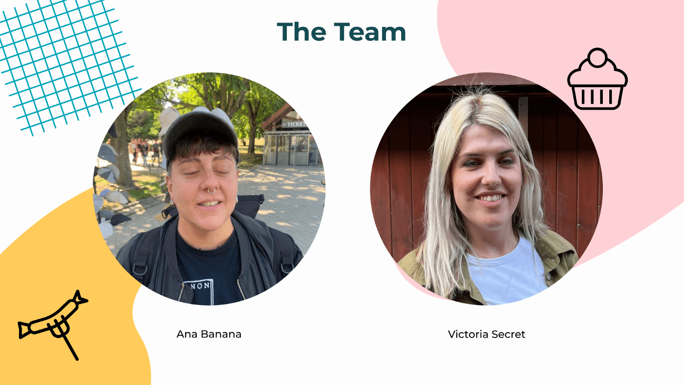
Last but not least, thanks Ana -again- for being a shoulder to rest my head on and, a safe place to do catharsis.
See you next time!
I know it wasn’t fun this time, I’m sorry, it won’t happen again.