
Being part of Amazon is not always a “beautiful” success: Goodreads
| Services | Platform | Client | Industry | Date |
|---|---|---|---|---|
| UX Research - UX/UI Design | Mobile (iOS) | Goodreads | Books | Sep 2022 |
How to improve such an ugly app but at the same time be traditional and popular due to the age range that manages? For this case study, we had the objective of cloning, and remodeling an app. The chosen one, or the one that chose us, was Goodreads.
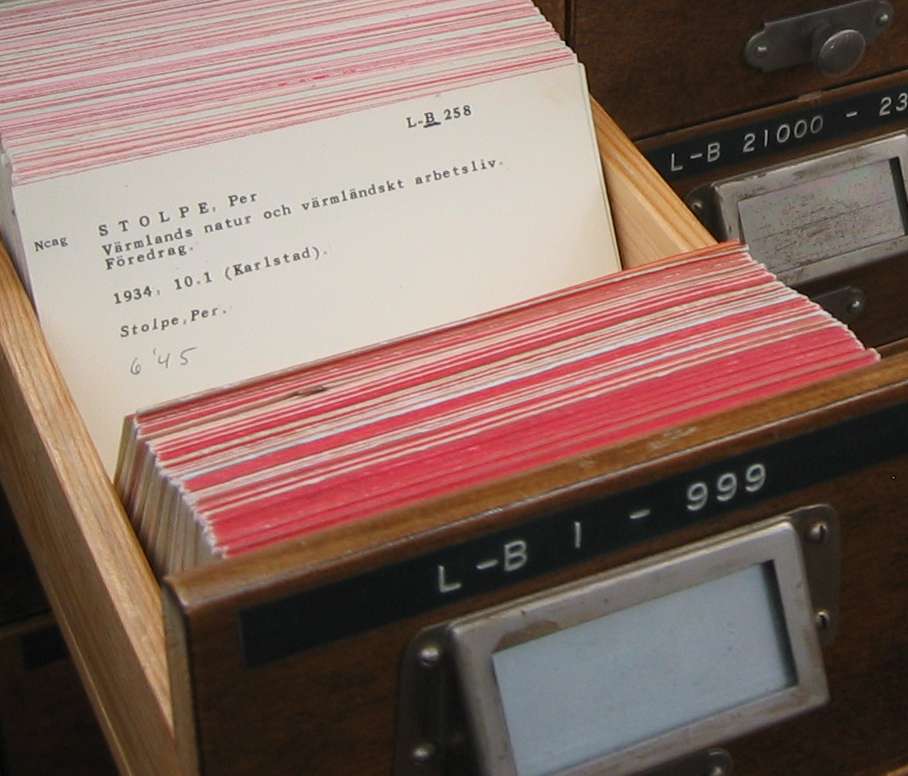
Goodreads, according to Wikipedia, is an American social cataloging website and a subsidiary of Amazon - can you believe it? - and allows individuals to search its database of books, annotations, quotes, and reviews - The problem? Well, the app looks like that old book that stands on your grandparent’s bookshelf, that smells musty, old and, from a product perspective: it looks bad, the UX does not make much sense and the UI looks like Windows 95 (if you know what I mean).
Overview
We selected the app of our choice for this UX/UI redesign. The only constraint was that we must select a well-known native mobile app (either iOS or Android); after selecting, we needed to make a clon, and follow the redesign process without a user research deep analysis, since the app is known and well investigated.
The Team
My teammate for this project was, luckily, my friend Ana. She is a writer and a career changer like me. She is not only my teammate, but also a former work colleague whom I had the pleasure of working with. If I had to describe her, I’d say she reads… she reads a lot. Me, on the other side, I only read newsletters and newspapers, I am definitely not a book lover. The first thing she mentioned about Goodreads to me was “the colors”. The colors remind me of the color of dirt, old books, and dirty wood floors. There were many apps to be redesigned, but we felt that with her being a user and me being a first-time user we’ll have different POVs, and will be a fun adventure.
Competitive Analysis
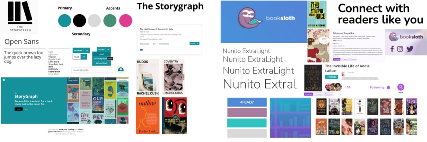
Since it’s a book app owned by Amazon, the competition is weaker at a glance. Reviews for Goodreads are over 433k against Storygraph for example, another similar app that has 600. Yes, only 600. But many people called it a “better Goodreads”, which is why we decided to analyze it as a strong competitor. The other was Booksloth, who is newer and, for now, free. With a strong investment on the social media aspect of reading and what are your friends reading.
Both competitors have basically the same functions, Actually, you can import your GoodReads lists to these two apps, and they also have the same organization modality of “read”, “currently reading”, and ”not finished”. Why am I saying this? Basically, the competitors want to be an option to Amazon. The User that won’t use GoodReads, will mainly have two reasons: archaic and ugly look or-in my opinion, the biggest reason- they hate Amazon.
The colors chosen for both apps must be one of the main “big” points to these apps that are really appealing to the eye, with a more “modern” look that differentiated them from the old and boring Goodreads. The Storygraph has a very appealing palette of colors, with greenish blue, white, and fuchsia. While Booksloth palette goes wilder and goes blue, with accents in green and Lila, and a black background.
Therefore one of our opportunities is to improve the UX knowing that the competitors have only followed Goodreads’ path.
Heuristic Analysis
One of the additional things we were asked in these projects was to make a heuristic analysis. To do this, we were required to make clone designs of the app.
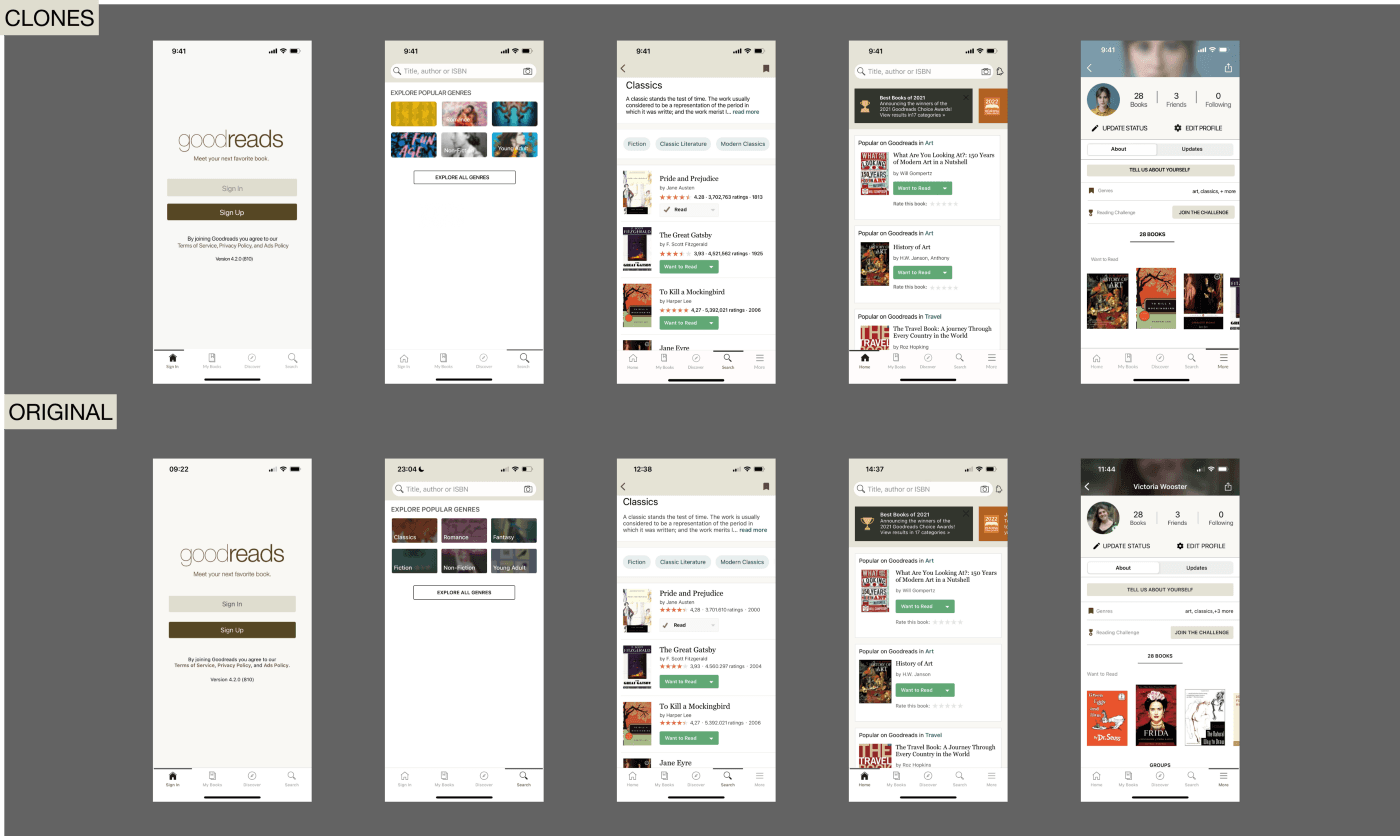
While making the clones we started to notice some of the problems Nielsen mentions in the 10 Usability Heuristics.
Mimicking the real world it’s something that GoodReads takes very seriously if we mention the colors of the app (yellowish as an old book’s pages)and the functions of letting us know on which page we left our book, like an old paper bookmark. On the other hand, for the User Control and Freedom, we can recall the emergency exit example, but in this case, the app looks like it was done in a hurry, there are a lot of duplicated options, for example, when you are searching for a book you have an “x” to cancel, and at the same time you have a “cancel” button.
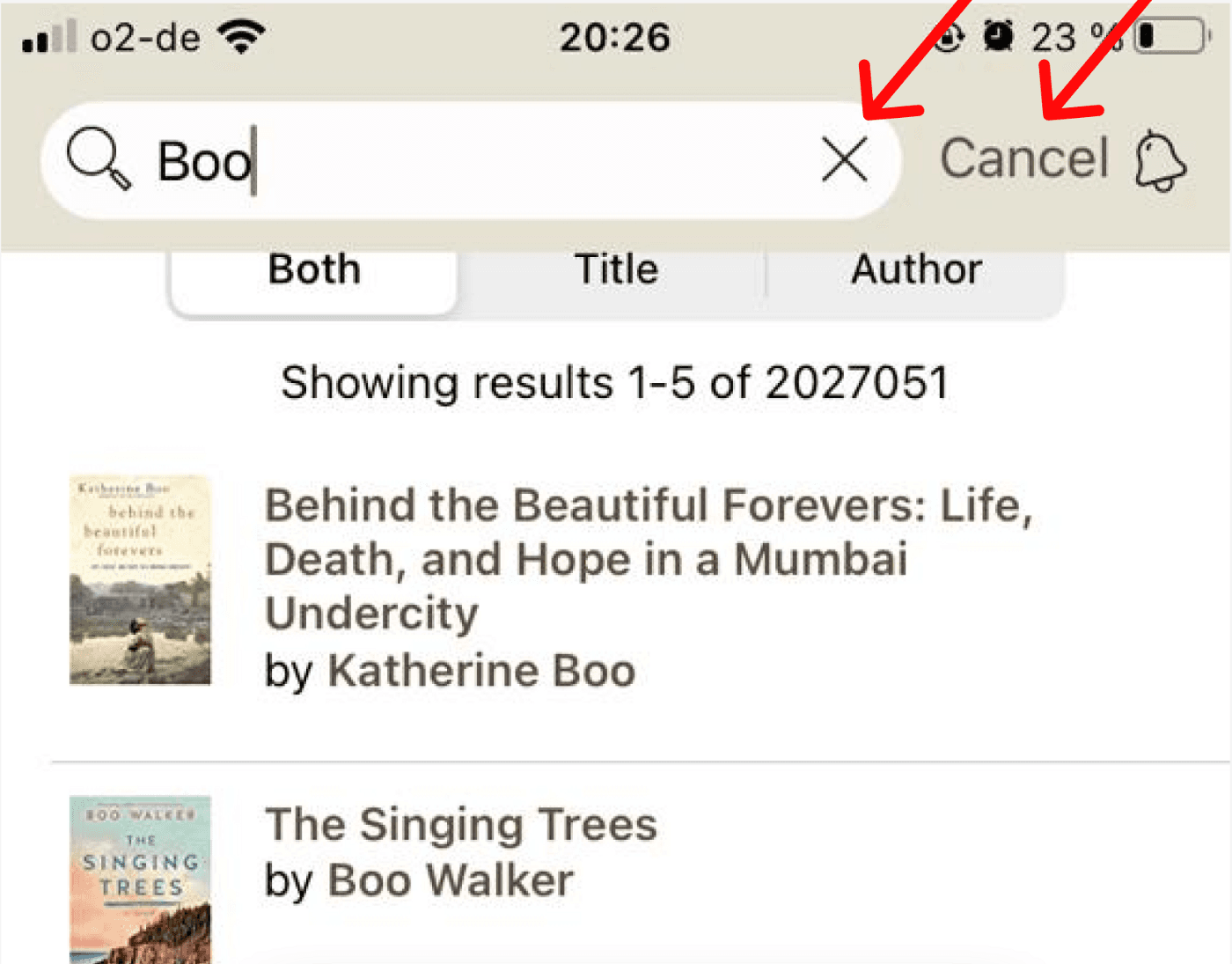
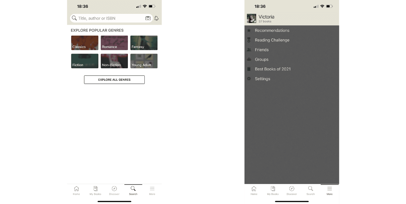
Regarding consistency, the book patterns vary from cover to cover. The app is also full of dropdowns and unnecessary menus that lead to the same way. When trying to add books to “my library”, the user has to navigate through unnecessary screens and drop-down menus before reaching the goal. Also, many other things you can notice while using the app: for example when hitting “search” 2/3rds of the screen is shown as empty space, and the “displayed profile menu” is a flat screen with 4 subtitles aligned on the top left part of the screen.
Problem Statement
We know the pros and cons of Goodreads, we understand the product and the competence in the market.
So therefore we can start the HMW questions to help build our PS:
- How might we update Goodreads UI interface to facilitate reading and navigating through the complex branching system they offer?
- How might we make the Discover option more attractive to returning and new users?
- How might we improve the way people rate and read books avoiding unnecessary drop-down menus and screens?
Now yes, we could make our problem statement look like this: Book lovers need to find a way to easily discover new books and keep their lists of read and unread books tidy because the current app is unclear and outdated.
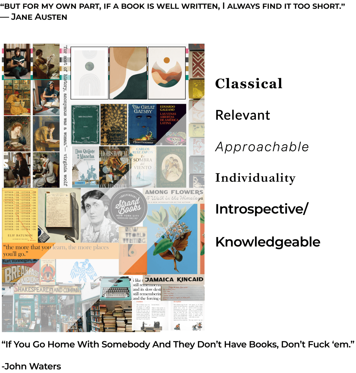
Moodboard
For the moodboard, we split and filled 2 blank canvases with what we thought Goodreads should represent for us: classic, relevant, approachable, individual, introspective, and knowledgeable. So we start looking for a more femenine aspect vindicating women as readers, writers, and individuals that enjoy the company of the book and art, and nature. And we came to this:
Style Tile
Yes. We keep the yellowish of the book pages but with more light in the colors, we add pink for the accents, orange for very special badges, and almost black for the text’s descriptions. As a secondary we eliminate the brown and add a bright teal that will give this fresh look, but with the pink that embrace a more young and femenine personality without being “girlish”.
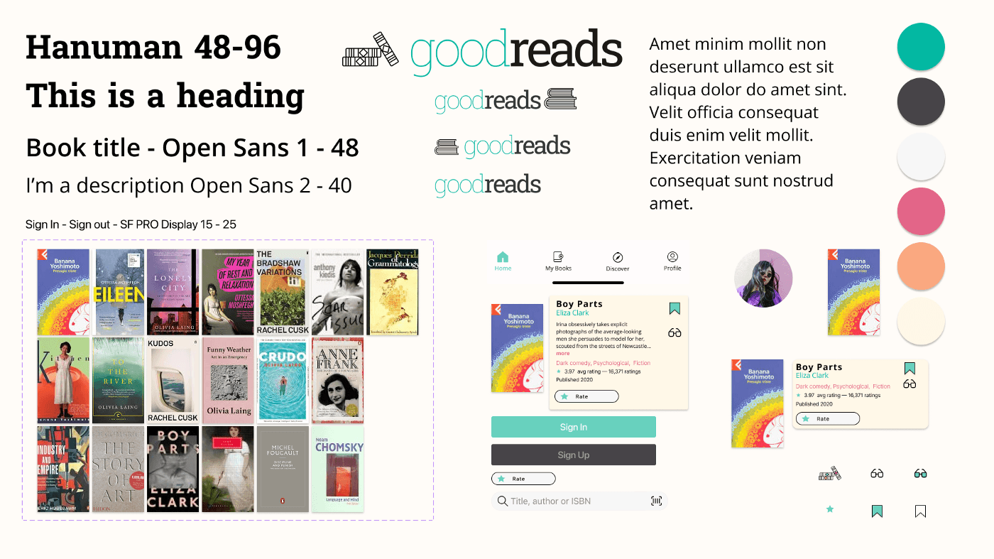
For the book cards, we decided to go for an index card look, if you don’t know what i mean it’s because you are too young, but this is what we meant, with a little information, the book cover and a new look.
Hi-Fi
Here is our final product. We go ahead with some UX changes and a completely new UI. To start the project I have to be completely honest, I dug online to check what people have done in the past. And what I found was not helpful, many people re-did the UI but the UX looks like it was never validated or tested.
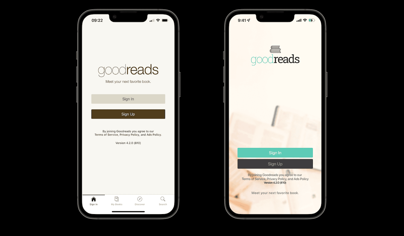
The first screen is the new log-in with the logo renewed, colors are more vivids, and there is no more that old and dump smell around the app. Once you are on the Home page, you can see the search bar and the book index cards. Each Index card, has the cover of the book, bigger than before since we think the cover art is a protagonist of the book and a big part of their identity. Then you can see the book title and a description.
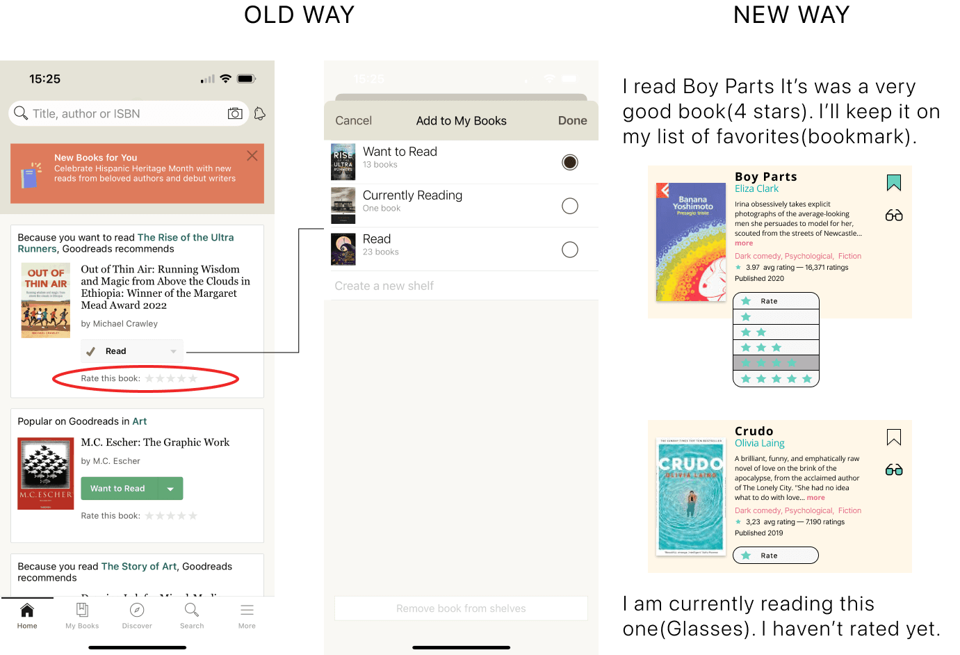
We erased the drop-down menu that indicated you if you read/currently reading/want to read, for a more simple way: If you want to read the book you’ll just press the bookmark and it will add it automatically to a list of books that you kept and if you are reading the book, you’ll just press the glassed and they will change of color and redirect the title to your list of currently reading. For those books you’ve read, you still have the chance to rate them. Because if you are rating a book, it’s because you’ve read it, right? Why would you have, aside from having the rating option, a dropdown to mark them as “read”? Rated, means read.
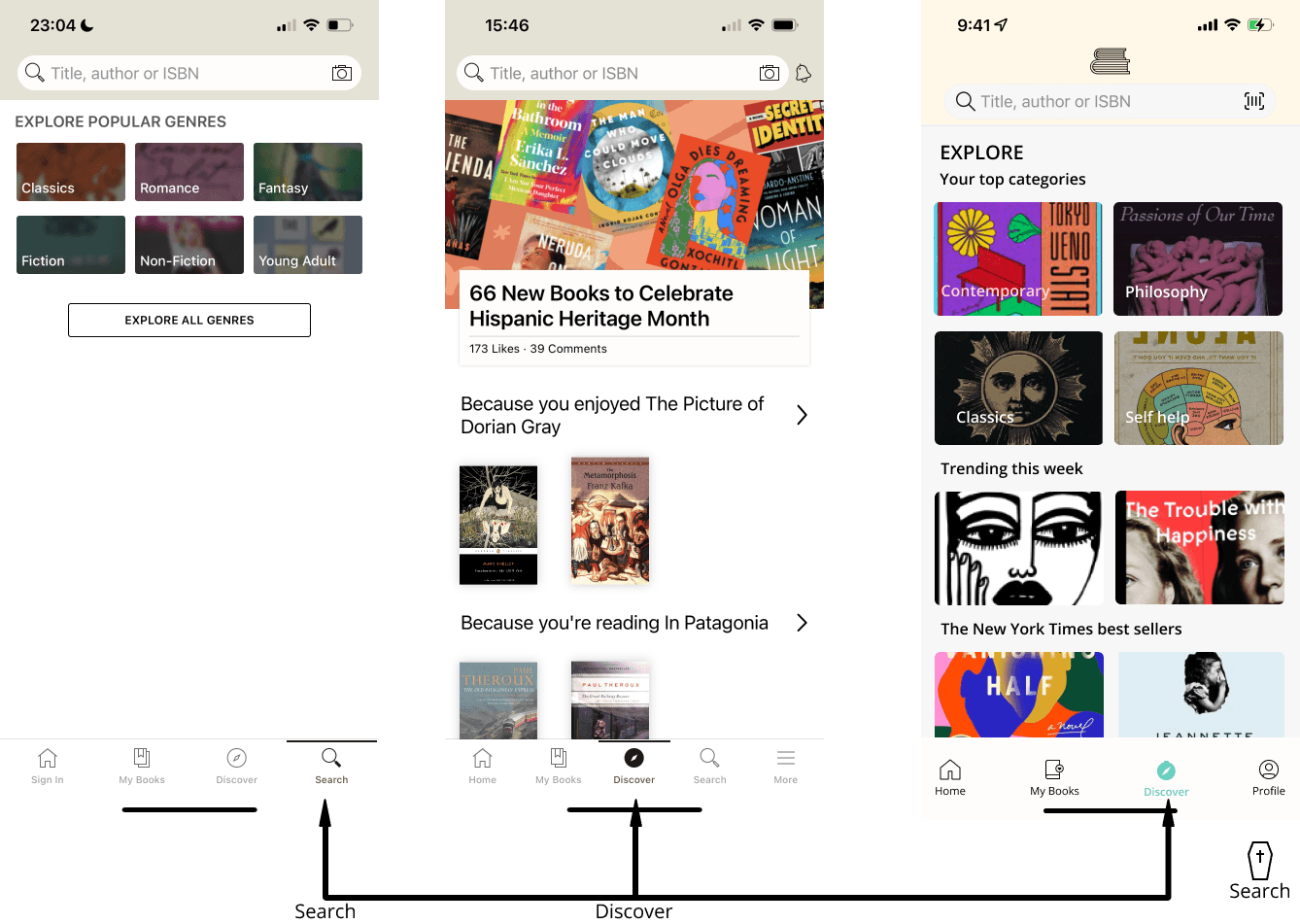
We must say goodbye to “search” in the tab bar, too. There is no sense in having a search tab bar item and a “Search bar” as well. “Discover” will make the honor of keeping your spirit alive, dear “Search Menu”. We won’t miss you.
Key findings
Choosing an application that is a stranger to me was a challenge. But the biggest challenge is the mobile app traditions in terms of aesthetics that sometimes you don’t realize, but once you put them into practice, it’s a matter of time before you normalize them. But when you start reverse engineering you realize that there are many things that were always in front of you, but you passed them by as if they were part of the environment. But somebody definitely put them there deliberately, with a why. That’s why when something is misplaced, the mistake makes itself apparent.
This was my first project with Ana, we shared many hours together as friends, but never so many as work colleagues. I am grateful to be able to nurture myself with a writer like her, a charismatic one. I recommend that you find an Ana to work with: it makes everything easier.
Once again, thanks if you’ve read this far, Dad. If you have any questions, don’t hesitate to contact me or leave a comment. See you soon!