Rent a car and buy a hand mixer…
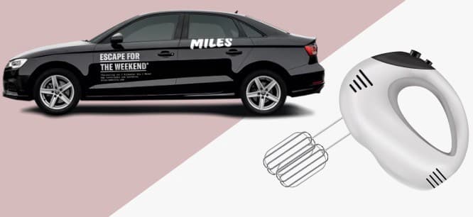
The exercise consisted on: choose a flow of five or more screens from an app you like. In this case I chose MILES Mobility GmbH, an app that offers rental cars around Germany. The goal here is to rent a car with a flat fee applied on the trip.

Why I chose this flow? Because it’s my project and I do what I…No, I chose this process because I find it very easy an economic to use this app to go to BER Airport in Berlin that is in the opposite side of the city. In fact, I hate to go to that airport, if you are not familiar with this airport here you can find some info.
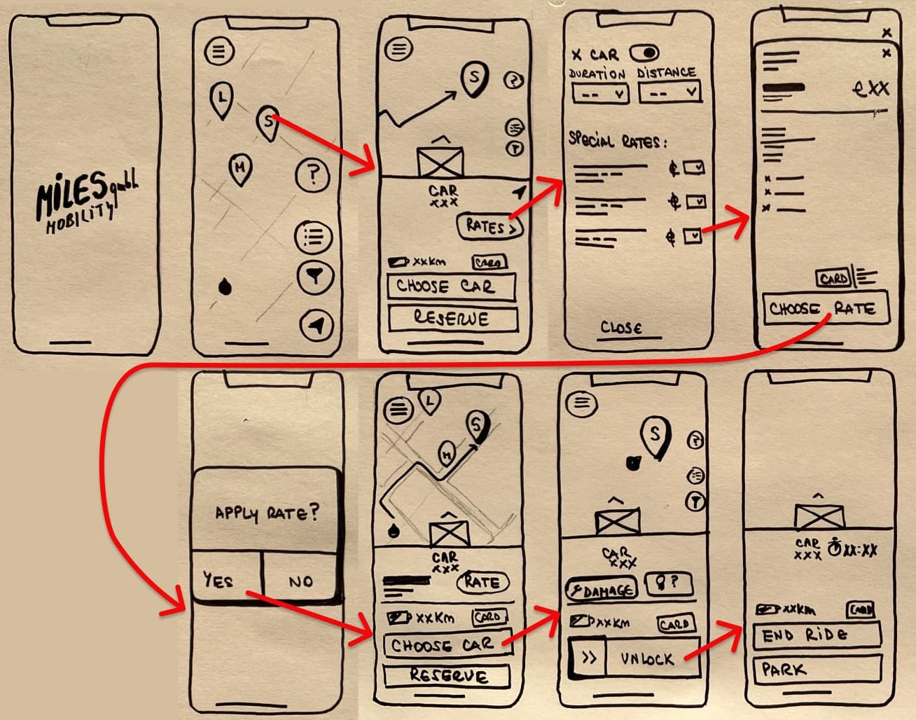
The flow consists of 8/9 screens, they look very similar and prio to use Figma I made a quick sketch (Did I wrote “quick”? Took me 2hs 😂) on paper of how the whole operation looks.

Some of the UI elements we see in the screens are buttons, image placeholders, icons, inputs, toggles, tooltips, maps, among others. I use the wireframe kits provided by Ironhack and also a google maps kit I found online.
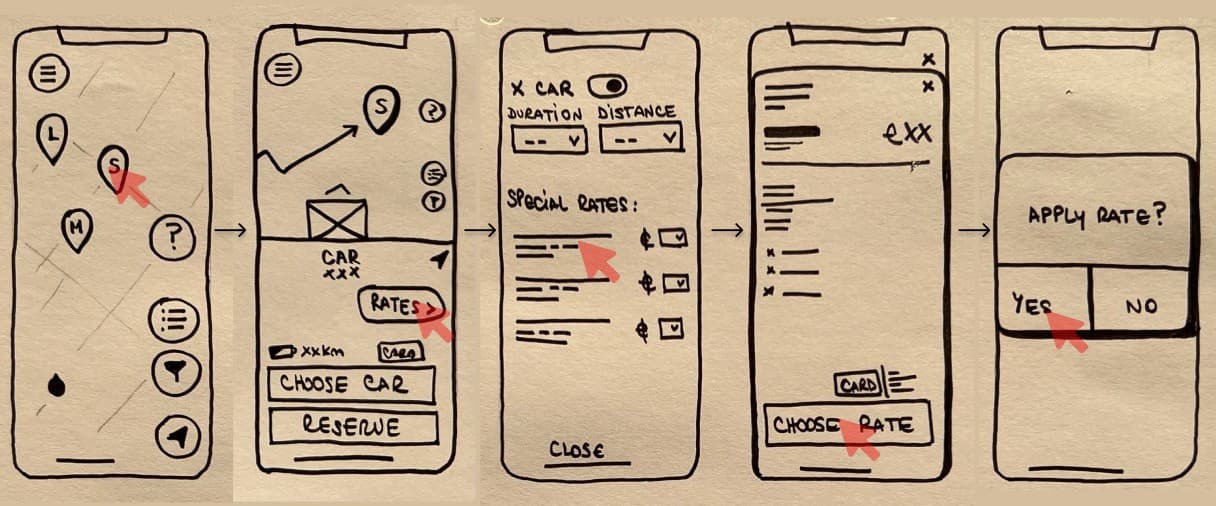
To understand better what’s the user flow, our main goal here is to rent a car choosing one of the flat fee the app offers and unlock the car.
The user has a pretty straightforward path in the app to get to their objective. First step is to, of course, open the app, where you can see a first loading screen with the logo of the company, and then you will land automatically on the second screen where you have the map that GPS locate your position and the cars that are nearby. The user needs to click one car in order to continue the task. After choosing the car, we could start the ride, but we want to set the Airport flat fee, so we click on the “Rates” button and another screen will appear with a list of possible fees we want to apply to our rental.

After choosing the flat we want the app will open a screen with the fine print and a detailed text about the fee, and after we tap the fee, there will be a confirmation window asking if we want to apply the rate.
Now we are ready to “choose” car, if we are far from the car we need to walk to the car, and when we are nearish (it works through bluetooth so the -ish has a reason to be) we can open the vehicle with the button “unlock”. This will open a “faceID” screen that will open the car and EUREKA, we are ready to start our trip.
Mistakes and Iteration
My firsts thoughts with the LoFi sketch were how easy and short the process was. But the more deep I got into the wireframing, the more complex things were getting. I was designing in Figma the wireframing and I started to realise the amount of elements needed that I was definitely missing, It was really heartbreaking.
As you can see in my paper sketch I totally forgot the FaceID part, and therefore I omitted it. I was hesitant on sharing this .JPG but, as part of the journey, I found it interesting to learn from my own mistakes.
The worst part came when prototyping, I was missing locators, tooltips and other components, like the “Face ID”, that part is automatically done by the app and I over saw it. As a result of too many questions I thinks I opened approximately seven Figma tutorials in one day. But at the end I was able to beat the machine and this is the final product: FIGMA: Miles Wireframe
Why an electric mixer?
There is a certain pleasure in using good apps and cooking tools. When we buy a hand mixer, we forget how tedious it is to beat by hand. The same thing happened to me with mobile apps or softwares. I think that when an app is well done, some things go unnoticed, because the usability is so pleasant that we take some steps for granted.
The very act of doing this kind of analysis on simple things helps to consolidate knowledge, put it into practice and realise that it never hurts to go back to the beginning and see what might be missing in your project.
If you’ve read this far it’s because you’re my dad OR you found my project entertaining, you can follow me here on Medium or on Instagram, where I share content about my dog “Fofi”, good and bad UX and of course, food.