Case Study: Dutch Museum Gift Shop
| Services | Platform | Client | Industry | Date |
|---|---|---|---|---|
| UX Research - UX/UI Design | Mobile & Web | Dutch Museum Gift Shop | Museums & Arts | Oct 2022 - Dec 2022 |
When you go to a museum, what place is impossible to avoid at the exit? Yes, of course, a gift shop. How many times have you thought: who decides that a magnet is the best souvenir I can take from this museum?
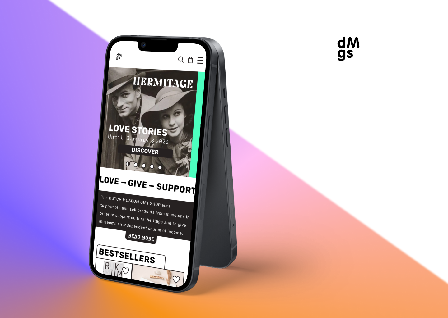
The Bootcamp was in the final stretch and the last assignment consisted of working with a real customer with real problems. The research analysis was going to be one of the most important things, since we didn't know if the client was going to want to implement our design...until now. But the client showed up, and it was not just one, but two: a museum and a gift store.
In this case study, I'll tell you what this journey with the Dutch Museum Gift Shop consisted of, a client who gave us all the freedom to work, and for almost two months we were able to collaborate to create a new design and improve the usability of a platform for gifts and objects from 17 museums in and around Amsterdam.
Brief
Our main goal was to improve the existing responsive website of the Dutch Museum Gift Shop (DMGS). It was set by the stakeholder that the priority was the mobile version, a desktop version will be needed to reflect the mobile in a few screens.
Duration of the project: 2 weeks officially, but between you and me, we continued working for 2 months, since the stakeholder wanted us to do so.
Tools that we used were Figma, Usability testing, Desirability Testing, Reaction Cards, paper, pen, etc.
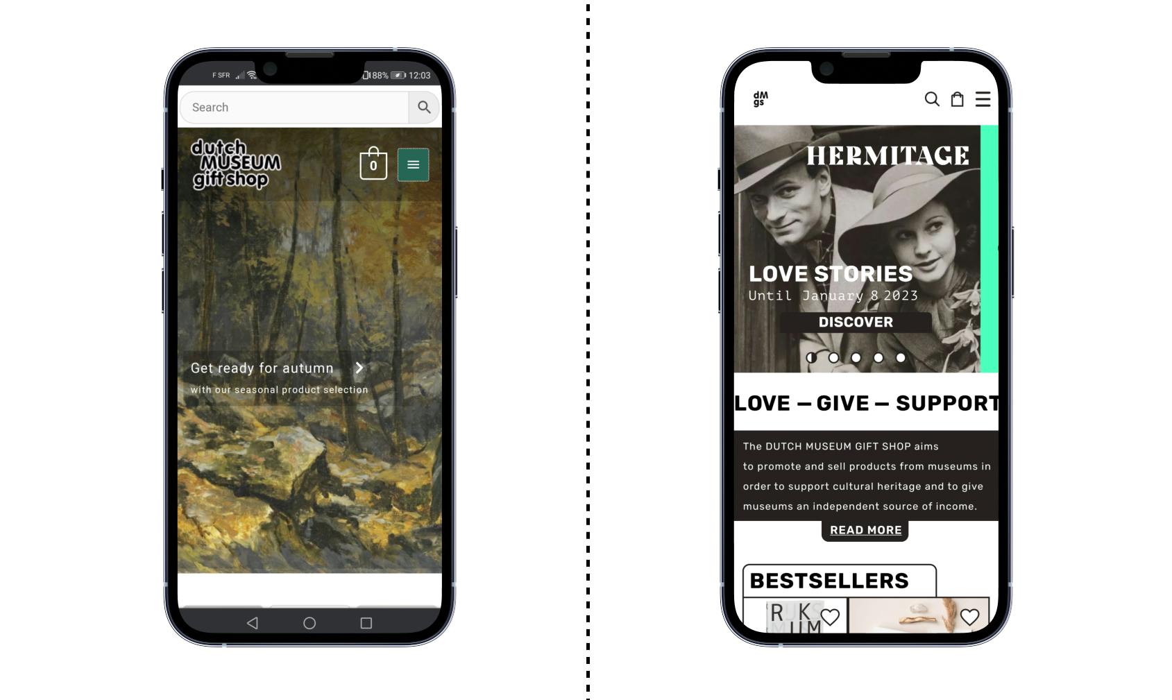
On the left we see the current DMGS site, on the right the final product
!!! SKIP RESEARCH AND JUMP TO HIGH FIDELITY PROTOTYPE!!!
Client
The clients, as I told you, were 2: Tropenmuseum and Dutch Museum Gift Shop. In this case study, I will explain the design thinking process of the DMGS. The founder of DMGS is Jitske Naberman. On their web that stated that DMGS is a “webshop where you can buy unique museum merchandise. The products are often in limited editions available and specially developed for an exhibition. DMGS aims to promote and sell museum products to support cultural heritage and provide museums with an independent source of income. ” The DMGS was born during the pandemic of 2020 and sells products from 17 museums across the Netherlands1. Since the Corona Crisis forced the museums to close and one of the only sources of income was the profits of the shop.
Must–Have
It’s up to us and our research, the client gives us a lot of research information and studies to back up our discussions. Nothing is done without a clear justification. I added this title, but there was no “Must-Have”, the web is done, and according to the studies is going well BUT… Jitske proposed we do a User Experience analysis of the web. She wanted us to do a whole research on which points were not working and try to improve the product. So, at the end of the project, we would have the opportunity not only to design a new website but to do a report on the main problems of the web from a more heuristic perspective and use the research tools we have organically.
We went for the first meeting with her, where we prepared the whole market research and show her how is the design thinking process and set some dates, and planned an agenda. What we didn’t expect is that she was super prepared for the interview, she made a presentation for us to make us understand the target group she was trying to aim for. During the presentation, she also showed us some pain points she was struggling with and the need to process that information into a new design. I think that was the moment when the four of us made a “click” and realize the potential of this project.
Team
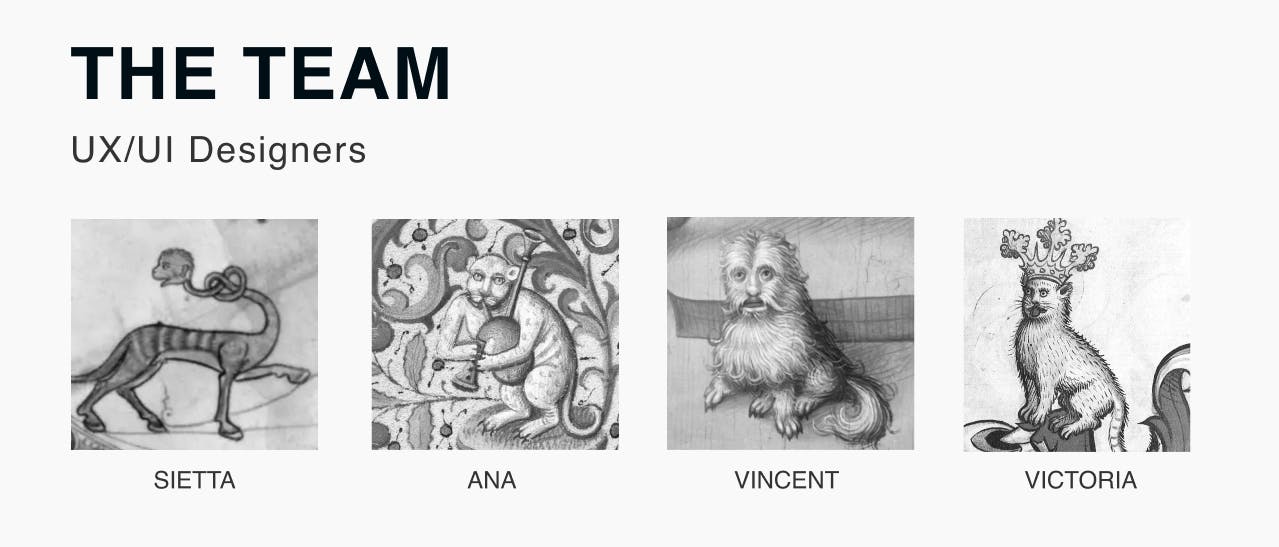
The team consisted of four persons: Sierra Meynell, Vincent Rosier, Ana Khatchikian, and me.
1 – EMPATHIZE
Secondary research
We started looking for similar websites according to the target that we were provided. And at the same time, we started looking for references of similar web shops, trying to look outside the box. And comparisons and insights to understand and get our idea of where we were standing.
Quantitative research
After our first meeting with Jitske, he gave us tons of quantitative information about the target users around the consumption of Museum Gifts in the Netherlands and the behavior of many people related to the platforms. The desktop usage was very successful for the number they were managing, but they wanted us, as a goal of the new design, to improve the numbers on the mobile side. Some important points to keep in mind that we got from the research on why users don't buy:
- “The souvenirs or the products often do not fit in my interior. They are often booklets, pens, key rings, something with little added value”
- “Lack of beautiful books”.“It doesn't add anything to the visit for me, so I think it's a waste of money”
- “I pay the ticket and rather support the artists directly”
- “Stuff is too expensive most of the time”
- “Often odds and ends and books. I only read e-books"
- “Don't think it's worth the money”.
Qualitative research
The round of interviews started on day 3 of the project, we set a questionnaire of 14 questions and 3 tasks that involved finding 3 random objects on the page. We interviewed people aged between 26 — 73 based throughout Europe and that visited a museum at least once a month and always“exited through the gift shop”. Answers were very wide, but most important every user despite their age run the tools very smoothly and differently. We also added at the end of the interview if they could tell us what are their online consumption and which sites they like more. On the DMGS, the task was to find a few defined items and purchase them. People had an issue with the navigation and finally, we ask our users for their overall feedback on this e-shopping experience.
Some insights:
- “The products seem unrelated, strange price range between high and low.”
- “There is no context. You would have to endlessly scroll if you are not looking for something specific.”
Despite the bucket of cold water that was the amount of feedback we received, we were able to understand and get rid of our presumptions. We proceed to analyze the information and organize all the data in an affinity diagram: we identified four big pinpoints:
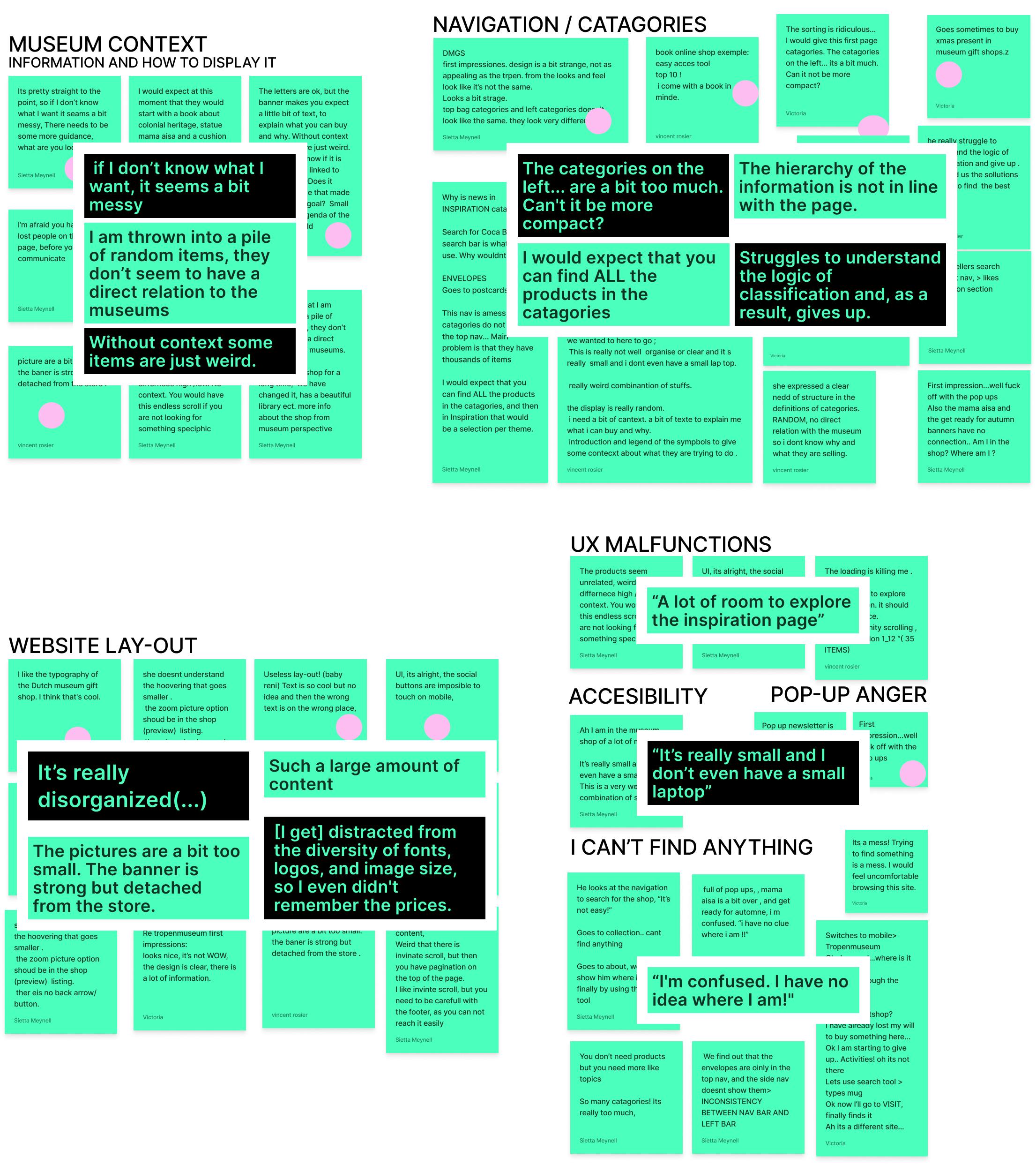
Based on all this, we could define the focus for our next step:
- Layout for the website (mobile-focused)
- Giving a clearer and bigger space for the museum's content.
- Clearer overall navigation.
- Improve user navigation for a wider audience and mitigate accessibility issues.
Business and competitive Research and insights
After our interview with the stakeholders, we also managed to get some very important insights about the goal that they were trying to reach and which were the brand values they wanted to transmit. But was it clear from the website perspective?
2 – DEFINE
User Persona: Meet Vera
Once we could see all the information, we dropped all the insights on an affinity map and started creating our user persona and User journey.
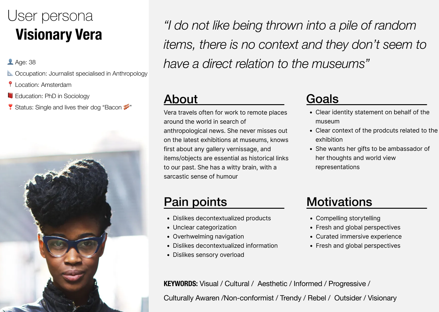
Meet Visionary Vera
Our person is a professional woman in her 40s, based in Amsterdam, looking for straightforward experiences that called out her 5 senses without a tangled path. She is a visual persona, that dislikes unclear information and chose everything with a clear mindset.
Problem Statement and MVP
Now that we have the information processed, our user persona done, we can try to identify the minimum valuable product and our problem statement: to do this, we start with a round of How might we... to be aware of the problems we are facing:
- How might we help DMGS visitors find the products they are looking for?
- How might we help visitors recognize the relationship museum/products?
- How might we make the product stand out as more desirable to purchase?
- How might we contextualize the products through a harmonious layout?
- How might design a logical hierarchy for the products?
- How might we communicate visitors the inspirational categories?
- How might we give users better access to the bestsellers' category?
New level unlocked: Problem Statement
People who visit the DMGS need to find the product layout/descriptions more enticing, attractive, and straightforward to buy because the site is too cluttered and confusing at the moment
After defining the Problem Statement, we got to the brainstorming of features we thought will be a good addition to the app. Therefore, we start the Moscow Method process to narrow down the options with a perspective in the priorities.
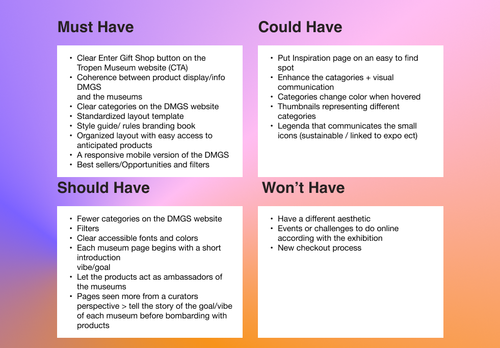
MVP of DMGS
- Clear statement of what DMGS is on HP
- Clear and fewer of categories
- Each museum must be able to convey their identity/goal, bringing context to the product
- Add filters
- Rethink a clear gift inspiration and bestseller section
3 – IDEATE
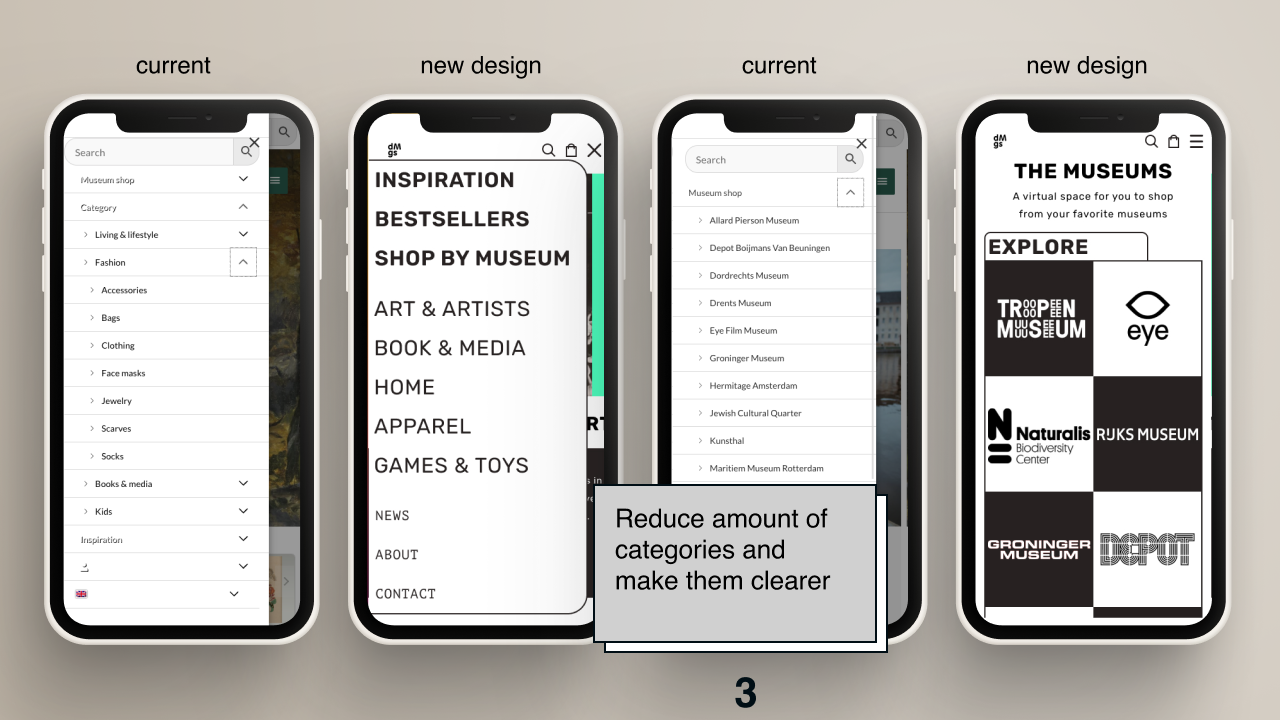
The ideation stage started, from the very first moment we knew we could not go crazy with the design, we must be accessible since the target group was +30 and ready for mobile. The first part consisted in reducing the number of categories. We started looking for options and references and did a session of organization with card sorting. These were the categories we were dealing with:
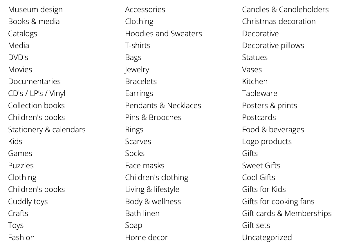
After some secondary research and user testing with a group of museum visitors from different backgrounds and with different native languages, we turned it into this:
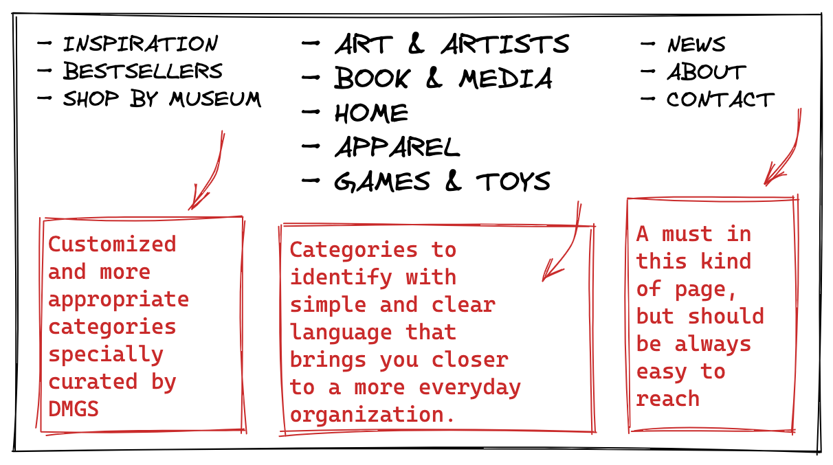
Not bad, right? The category research and validation consisted of thinking of a random product and checking which category you would put it in. 90% of the people got it right and we took into account targets with different native languages.
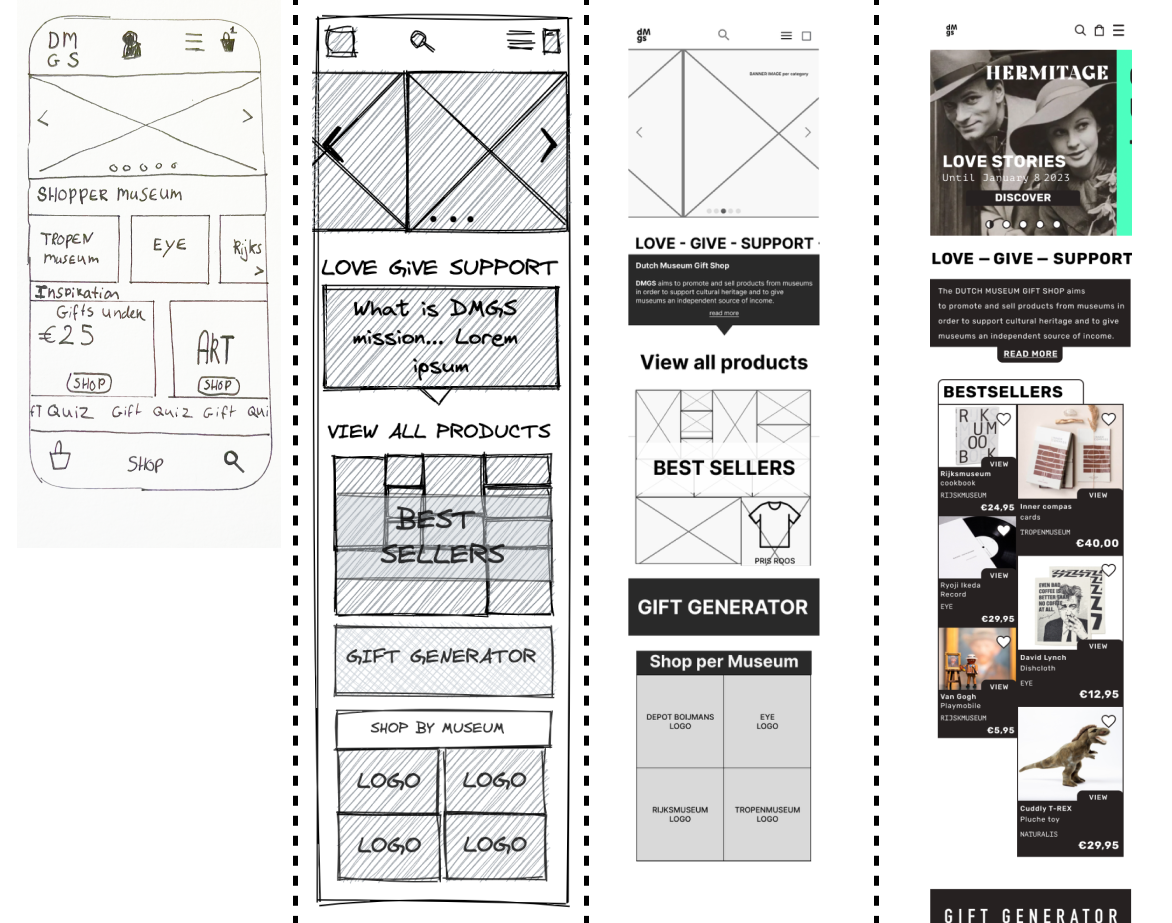
Concept Sketch
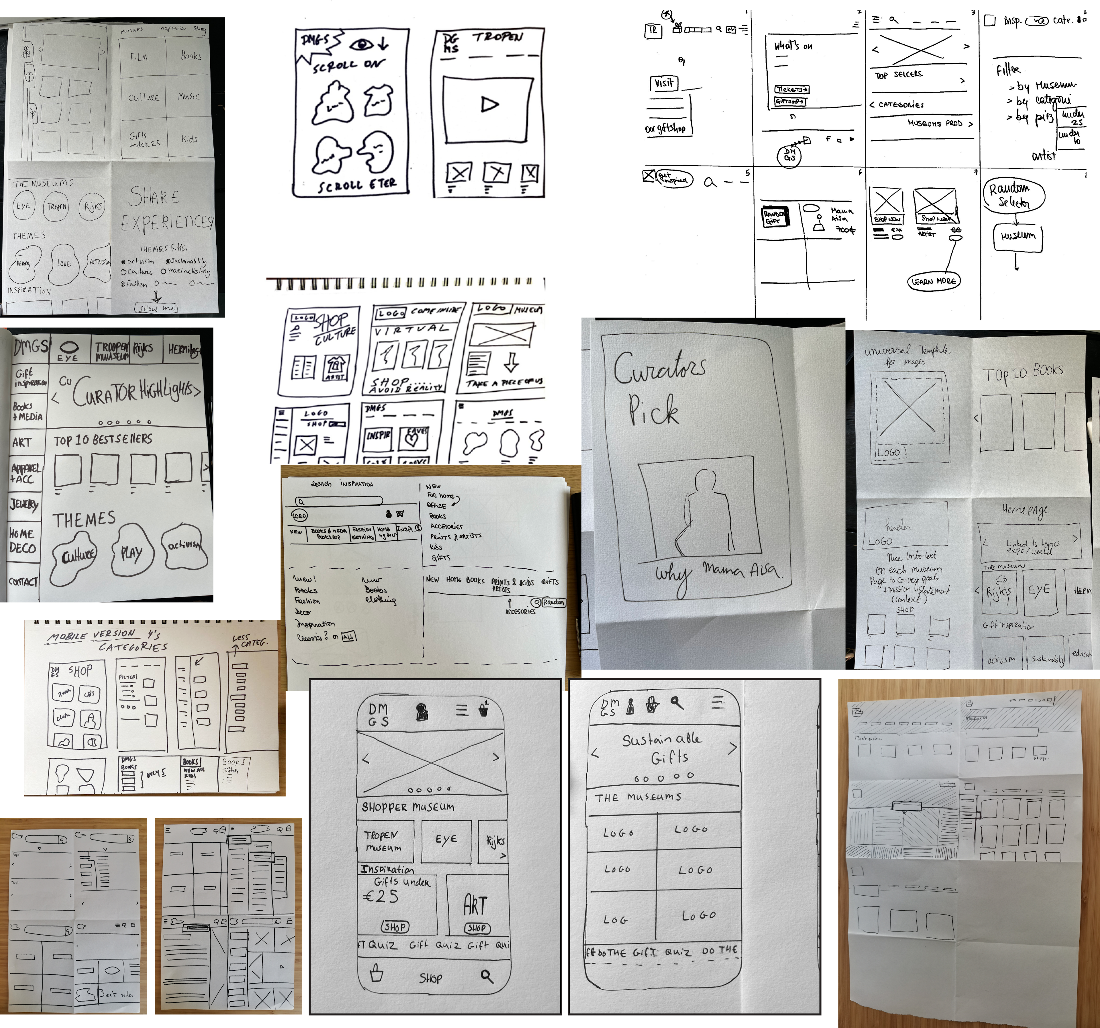
In my opinion, the best part was just beginning. It was time for concept sketching, we needed to start putting on paper our freshest ideas. As we were 4 members we found it feasible to do a round of Crazy 8, and the results were varied, but among the most popular ideas, we came up with the first ideas of how the layout of the app was going to be and also features like the "gift Generator" a function that allows you to generate a gift through a questionnaire that the app offers you. We also decided to mix the side categories with the top categories in one with our improved version.
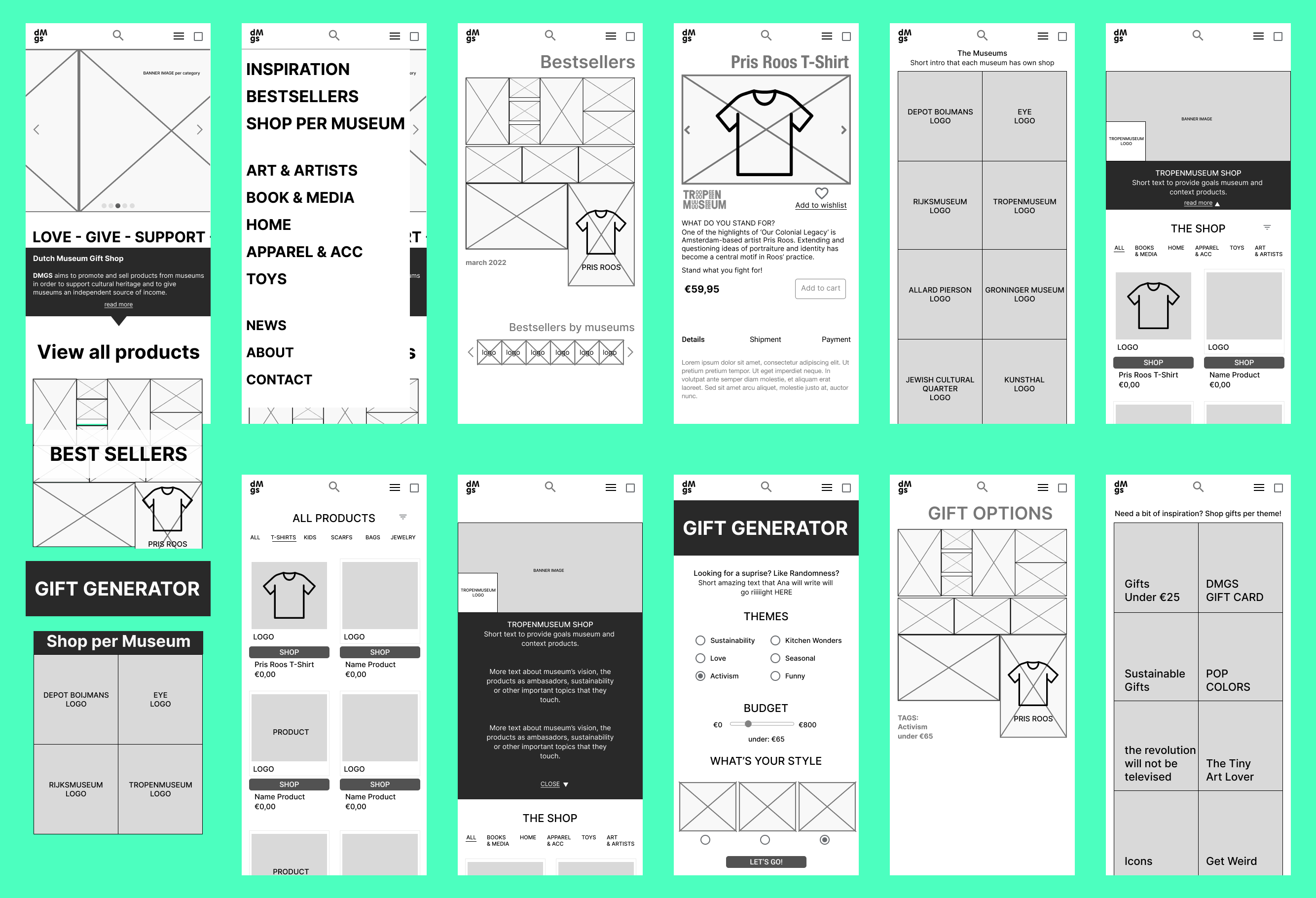
Mid-fidelity Wireframe
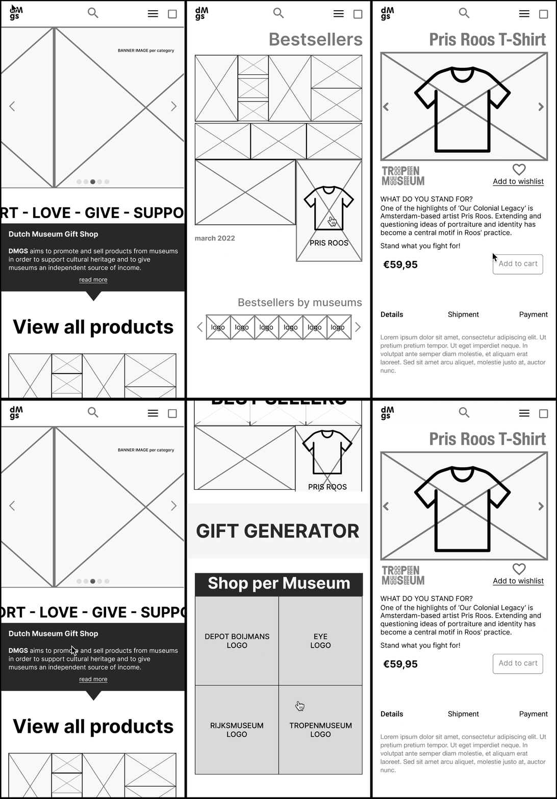
Validation with stakeholders
We met with our second meeting with Jitske, where we showed all our designs and new features. The stakeholder was very positive with the results and gave their approval for the next steps.
Moodboard
While conducting user testing, we started to create a mood board for our app to validate the brand values of our product.
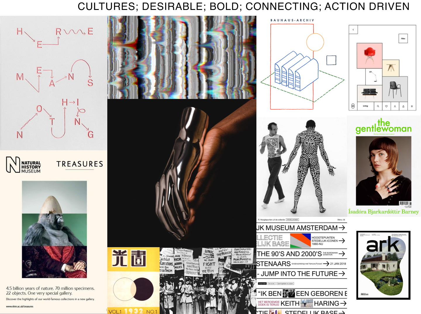
Arty, right? Can you guess which pictures where added by me?
And since the brand values were already imposed by the clients, we run a small sample of user to validate the brand values. We jump immediately to look for UI inspiration that reflects the brand values in a Style Tile:
Style Tile
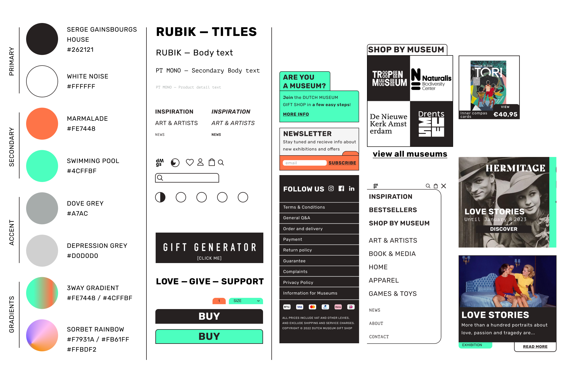
For the style, Sietta came up with the concept of old index cards, like those used in libraries in the old days. We used a similar concept with Ana for the [Goodreads] (https://thewooster.eu/articles/goodreads) project, but this time was more about the aesthetics of the whole app.
To complement the style of the index cards, the typefaces we chose were RUBIK, a bold sans serif with rounded corners, and PT MONO, a monospaced font from the PT Project series reminiscent of the courier font, or simply, the typeface used on typewriters. Vincent, our animation genius, created micro-interactions for the logo, menu and header, which added a fresh feel to the experience.
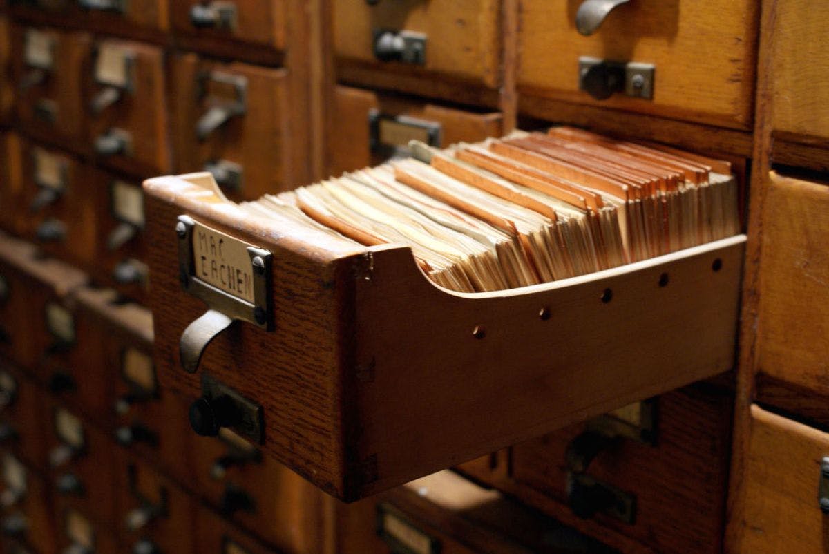
Old Index card archive in action
4 - PROTOTYPE: High-fidelity
Mobile version
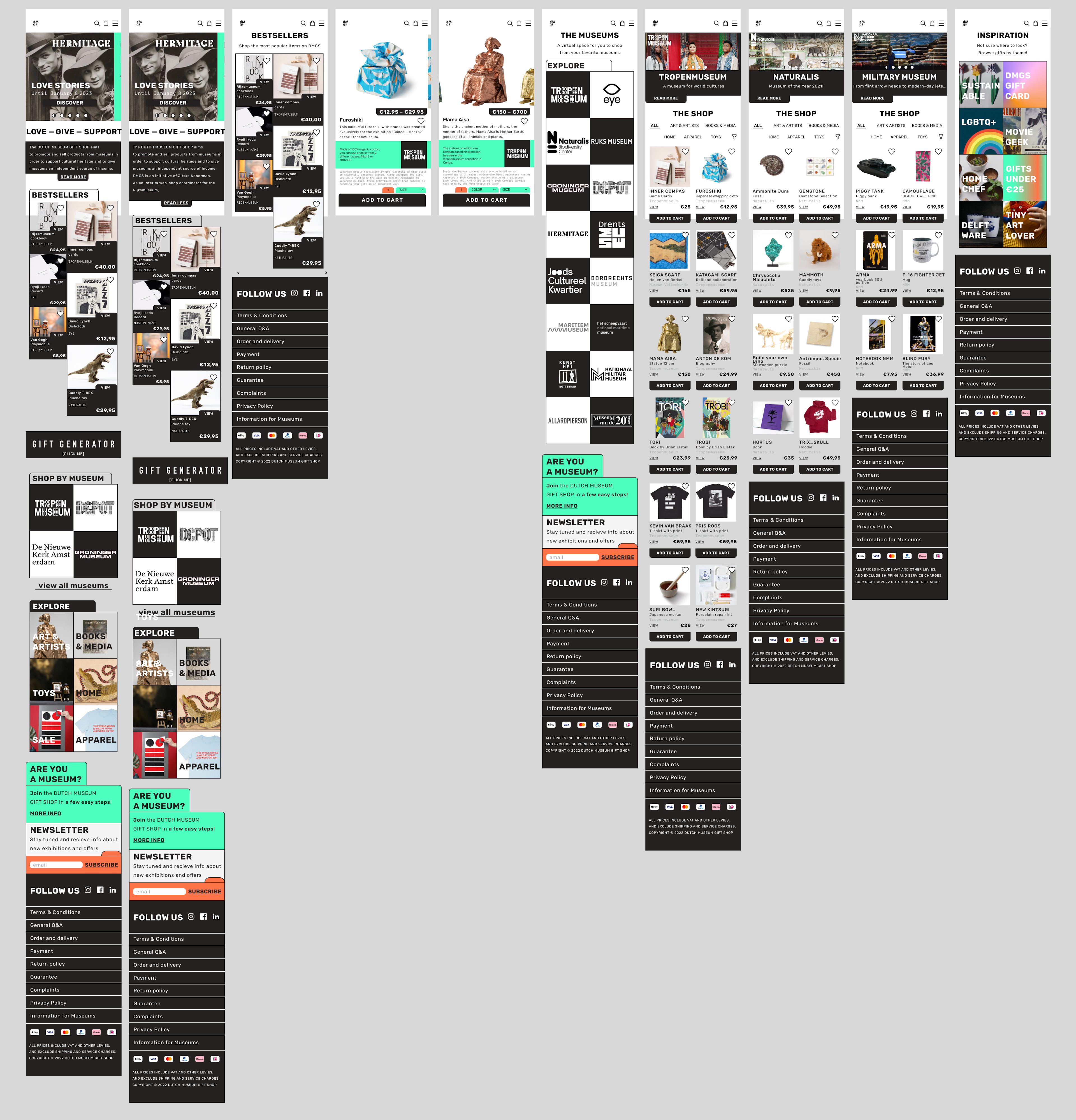
A view of some screens of the prototype
We created the mobile hi-fi prototype and tested it right away. Overall the testing stage was successful. We tested on more than 15 people, where we gave them two targets and then had them answer a desirability test. Of course, we also had a meeting with the stakeholder, where she proposed us to change the design of some parts of the product cards to adapt them to a product closer to what the team of web developers could improve. But without further games, let's jump to the mobile prototype, in this case Iphone 11, since it is a device that is not one of the most expensive, but it is not lagging behind in terms of screen size and proportion.
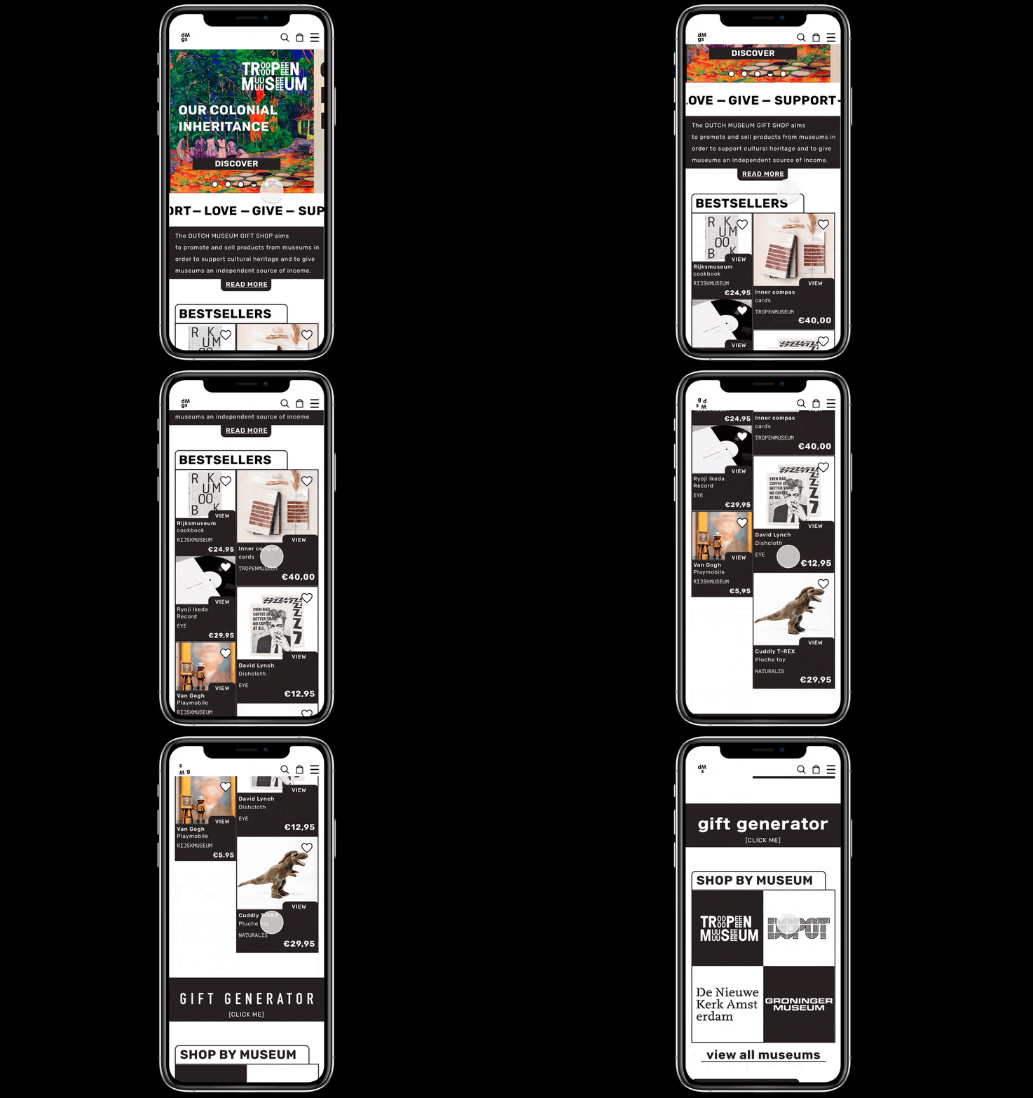
If you have a Figma account, here is the Prototype link: DMGS Prototype
- The hamburger menu, with a less clutter list of categories, where you can relate any product though a category. The menu has the identity of the whole page, but at the same time has the “arty” vibe”
- The gift generator: For us, one of the star features of our design. Many people through testing, told us that everything look very beautiful but they were not good at making choices, so we decided to make a feature that though a monkey survey gives you a curated page of gifts that you may like to buy.
- And the Museum logos in a more fun and easily spottable way.
The usability testing
In order to test our hypothesis, we needed to test our MVP, or in English: we needed to check if the new design worked. So we arrange 10 interviews with people who would be a part of our target group and invited them through Userberry, the testing app. The test consisted in 2 tasks:
- First, the person would have to buy an object, and second, they would have to use the gift generator. -After the successful task, they were redirected to a survey where they were able to give their insights.
What was cool about this? We could test with people from Argentina, France, UK, Germany, and the Netherlands. Since we all speak many different languages, we were able to do the interviews in the subject language, and they were "forced", like in real life, to deal with an English website. In my opinion, the results of the research were a privilege, since you don't always get to express yourself as well as in your mother tongue when dealing with this kind website. You usually visit museums around the world, and the experience is always in English. But being able to share your thoughts in "your own words" it's something closer to the truth.

Survey results, click map, and heat map of the test rounds
Results where really good, 60% or success on the tests, and the insights from the survey where very encouraging.
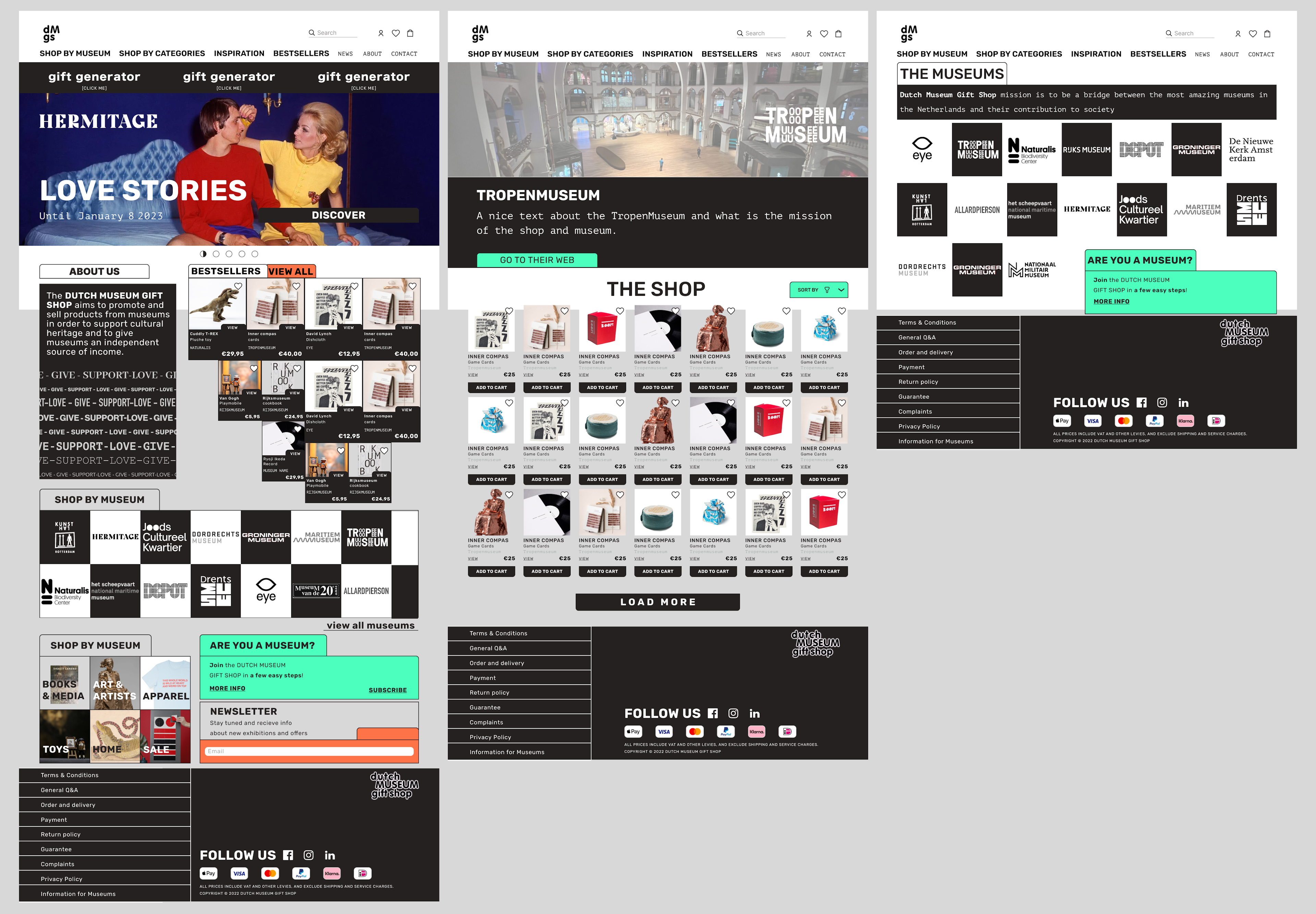
Desktop version
While we were testing, we were also trying to create some screens for a desktop version. The latest desktop version has a more simplistic logo than the original. The category menu is in plain sight, there are no hidden categories or subcategories. It is created in blocks thinking in bringing the mobile application to a desktop model, prioritizing the mobile model.
Conclusion
It was very interesting to be able to work with clients of this scale, and also to be able to work with such an amazing team of designers. There were moments when things got tense, but it was those moments when the conversation became very fruitful, we trusted in the Design Thinking Process, and the creativity started to flow, and organizational skills started to emerge naturally.
What's next for DMSG? As I always say: ITERATE, ITERATE, ITERATE. The next steps will be to finish the newsletter template, implement the new aesthetics on the social media channels, and have a meeting with the developers to see which parts of the features could be implemented and which ones we could help adapt to the tools they already have. DMGS is currently implementing some solutions to the usability part related to accessibility and design.
If you have any questions or would like to discuss this case study, please do not hesitate to contact me.
I hope you enjoyed this article. See you soon.
Footnotes
-
from November 7th they are actually 18, Mondriaanhuis just joined the project. ↩